Durango Bill’s
Debunking the Deniers of Global Warming
The “Global Warming Stopped in 1998” Lie
Global Warming Deniers claim that Global Warming is a hoax/fraud/scam.
They lie, they are willfully ignorant, and they are wrong.
“Global warming is unequivocal and primarily human-induced.”
( Link )
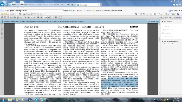
One of the false claims that Global Warming Deniers have been making in recent years is that “Global Warming Stopped in 1998”. (Alternately they may pick some other year that “global warming stopped”.) As per usual, this claim is another deliberate GWD falsehood that can be easily debunked by looking at the actual observations.
The Actual
Temperature Record
The year 2016 set an all-time temperature record as measured by NOAA’s National Climate Data Center.
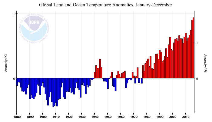
The graph above shows the
NOAA/National Climate Data Center12-month average temperature
data up thru Dec. 2016.
Data source: ( Link
)The year 2016 set an all-time temperature record as measured by NASA/Columbia University’s Goddard Institute for Space Studies.
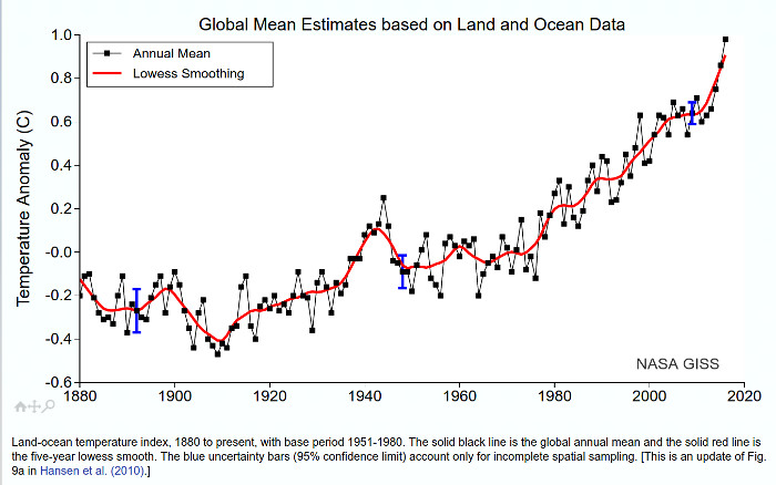
The graph above shows the GISS 12-month average temperature data up thru Dec. 2016.
Data source: https://data.giss.nasa.gov/gistemp/graphs/
The year 2016 set an all-time temperature record as measured by the UK’s Hadley Climate Research Unit.
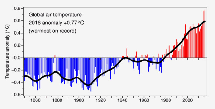
Data source: http://www.cru.uea.ac.uk/
The year 2016 set an all-time temperature record as measured by the Japan Meteorological Agency.
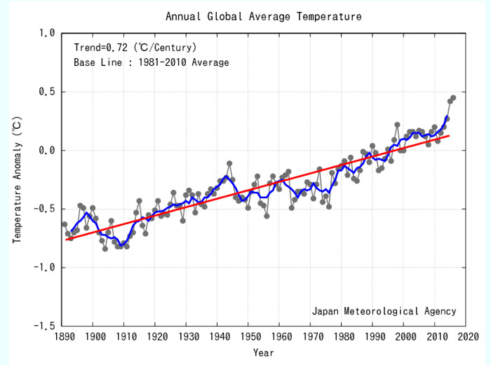
Data source: ( Link )
The year 2016 set an all-time temperature record as measured by Berkeley Earth Analysis.
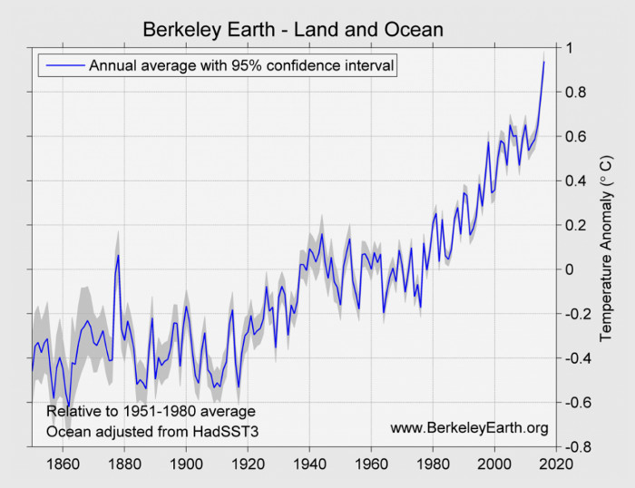
Data source: http://berkeleyearth.org/global-warming-2016/
And what do the Global Warming Deniers say about this record warmth?
Temperature records can’t be trusted because:
It’s a conspiracy.
Then and now photographs of melting glaciers can’t be trusted because:
It’s a conspiracy.
See “Melting Alaska makes the front page” ( Link )
Videos of high tides flooding Miami can’t be trusted because:
It’s a conspiracy.
See “Miami Beach Sea Level Rise, Paradise Lost!”
http://www.youtube.com/watch?v=H4UueAile5A
Also see: “Miami Beach’s battle to stem rising tides” ( Link )
Anything that is not part of our “Alternate Reality” can’t be trusted because:
It’s a conspiracy.
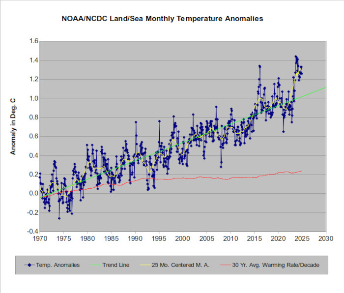
The graph above shows the up-to-date global temperature anomalies as compiled by NOAA/NCDC (National Oceanic and Atmospheric Administration / National Climate Data Center - http://www.ncdc.noaa.gov/ ) from 1970 to Apr.2025. Individual months, a (yellow) 25 month centered moving average, a (green) least squares trend line, and (red) 30-year warming rates {degrees C. per decade) are shown. The graph uses data that can be found at: ( Link )
Current warming rate (Slope - red line) = 0.25 degrees C. warming per decade.
Note: NOAA’s National Climatic Data Center (NCDC) maintains the world's largest climate data archive.
If you want to use calendar years as your measurement tool, then the NOAA/NCDC data shows that 2003 broke the 1998 average for record warmth.Then 2005 broke the record again.. Then 2010 broke the record again. Then 2014 broke the record again. 2015 set still another record. And 2016 set still another record. And the process continues to the present. (Data available at ( Link )
The NASA / Columbia University temperature database shows a similar pattern. http://data.giss.nasa.gov/gistemp/tabledata_v3/GLB.Ts+dSST.txt
Each data point for the warming rate (red line) is the least squares slope per decade for the 30-year period ending as of the plot date. Thus the left end of the red line is the least squares warming rate per decade for the 30-year period from Feb. 1940 through Jan. 1970. The data point at Dec 2024 shows the least squares warming rate per decade for the 30-year period from Jan. 1995 through Apr. 2025. Etc.
What is interesting is that rate of warming (red line) is at an all time high as of the 2020's. The rate of warming is the greatest in recorded history - which means the warming rate (in degrees per decade) is slowly accelerating.
Global Warming Didn’t Stop in 1998.
Land vs. Oceanic
Temperatures
It is interesting to compare the temperature record for land areas vs. the oceans. (Land areas in the northern hemisphere (where most human beings live) are used since southern hemisphere land temperatures are more subject to oceanic modification.)
71 percent of the earth’s surface area is oceanic. Any forcing that would tend to change the earth’s temperature is slowed by the oceans since it takes a huge amount of heat input to produce much temperature change in the massive volume of the oceans.
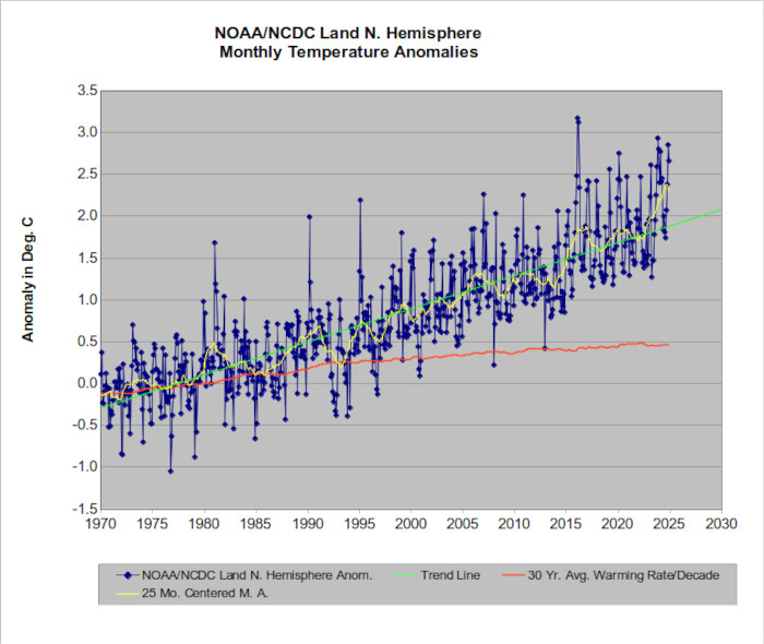
Current Slope (red line) = about 0.50 degrees C. warming per decade. Again, this is the fastest warming rate in recorded history.
The chart above shows the Northern Hemisphere “Land Only” temperature record as measured by NOAA’s National Climate Data Center. The actual data is available at: https://www.ncdc.noaa.gov/monitoring-references/faq/anomalies.php
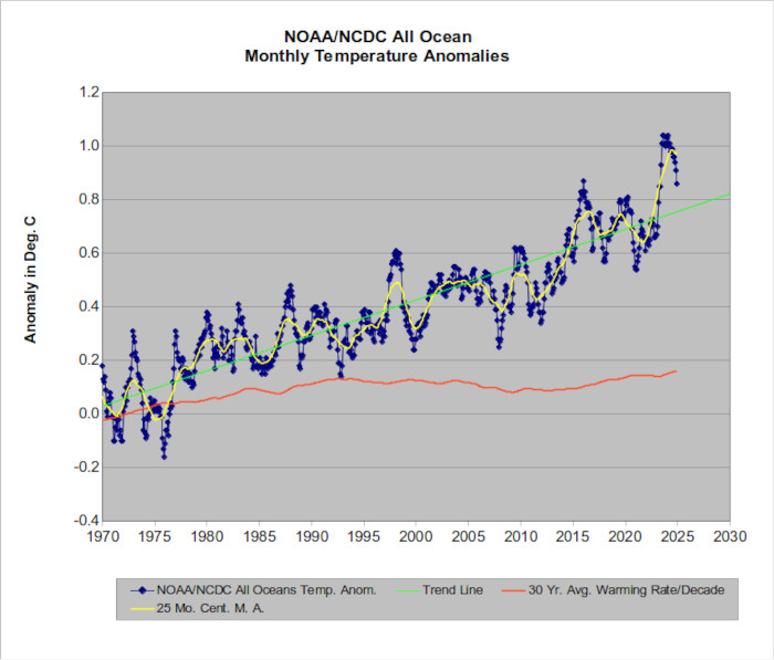
Current Slope (red line) = 0.17 degrees C. warming per decade. Once again, this is the fastest warming rate in recorded history.
The chart above shows oceanic surface temperatures. Again, the actual data is available at: https://www.ncdc.noaa.gov/monitoring-references/faq/anomalies.php
If you compare the two charts, there are several noticeable differences. First, there is a much greater month to month variation in temperatures for “land only”. This is to be expected since inland areas such as Chicago are going to have much larger temperature variations than oceanic areas.
Of greater significance, the rate of temperature rise for “Land Only” is triple the rate for ocean temperatures. The lag effect of the oceans has less influence over land areas. Thus “land only” temperatures are more “up to date” in showing what is really happening with global warming. Note that the rate of temperature rise for land areas as shown by the red line is 0.50 degrees C per decade which is 9.0
degrees F per century.
Greenhouse gases produce thermal forcing which is equivalent to the heat of just a few mini Christmas tree lights per sq. meter. It takes decades at this rate to significantly warm an oceanic column of water that is thousands of feet deep. However this net forcing is a 24/7 average, and current levels of atmospheric carbon dioxide have already committed us to hundreds of years of future oceanic warming.
The years 2011 – 2013 were characterized by an increase in mixing between warm surface water and deeper cool water in the earth’s oceans. (Large storms such as Hurricane Sandy are really good as mixing agents.) Mixing cools off the surface water - and the air above it. This mixing caused oceanic surface temperatures to lag further behind the warming that has been observed in land areas, but once you know what has held back the “sea” component, it becomes obvious that:
Global Warming did not stop in 1998.
Deep Ocean
Heating
As measured by the amount of heat going into the earth’s oceans, it looks like global warming may have actually accelerated since the year 2000.
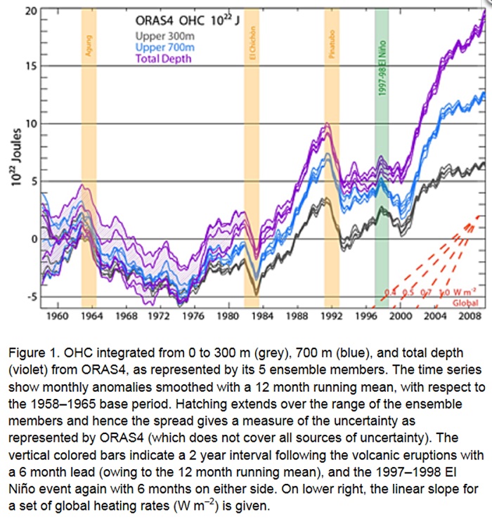
The graph above shows the amount of heat energy that has been added to the world’s oceans. The original graph can be seen as Fig. 1 in the published paper “Distinctive climate signals in reanalysis of global ocean heat content” which can be accessed at http://onlinelibrary.wiley.com/doi/10.1002/grl.50382/full
Note: OHC stands for Ocean Heat Content
To give some idea of the amount of heat that has been added to the oceans, 1023 Joules is enough heat to warm over 67 thousand tons of water from 40 deg. F to 140 deg. F for each of the 7 billion people on planet earth. (1,000 Joules ~= 0.94845 BTU)
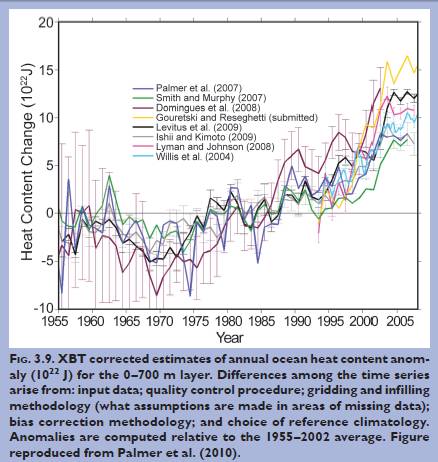 The chart at the right
shows the results of other studies that have measured the increase
in oceanic heat content. Thus the results of the more recent study
confirm these earlier studies. The original version of the graph
at the right can be seen at: NOAA’s 2009 “State of the Climate”
report. Downloadable from: ( Link
)
The chart at the right
shows the results of other studies that have measured the increase
in oceanic heat content. Thus the results of the more recent study
confirm these earlier studies. The original version of the graph
at the right can be seen at: NOAA’s 2009 “State of the Climate”
report. Downloadable from: ( Link
)This earlier chart shows the “Heat Content Change” of the top 700 meters of the world’s oceans as measured by several researchers. As above, the unit of measure is “Joules” which is the standard metric measure for energy. (Note: XBT stands for expendable bathythermagraph data)
The vast majority of the heat imbalance due to global warming actually goes to warming the oceans. The increase in air temperatures and glacial melting is actually just a small component.
As noted below, the Pacific Decadal Oscillation appears to determine (or measure) where the heat from thermal forcing ends up. In recent years, ocean currents (which are subject to the PDO) are continuing to circulate heat from the ocean’s surface down to deeper levels.
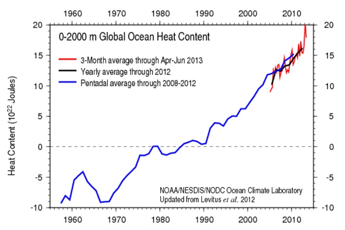
The graph above is from http://www.nodc.noaa.gov/OC5/3M_HEAT_CONTENT/ and updates Ocean Heat Content up through June 2013. The world’s oceans continue to warm at an accelerating pace.
Note: Ocean temperature measurements are made by the Argo buoy system.
http://www.argo.ucsd.edu/About_Argo.html
It can be easily calculated that the increase in oceanic heat from 6E22 Joules in 1998 to 19E22 Joules in 2013 is equal to the accumulated heat content of detonating over 4 Hiroshima Atomic Bombs per second (running 24/7 = 126,000,000+ bombs per year) from 1998 to the present. ( Link )
(See http://en.wikipedia.org/wiki/Little_Boy for the 67E12 Joules heat content of one of these bombs.)
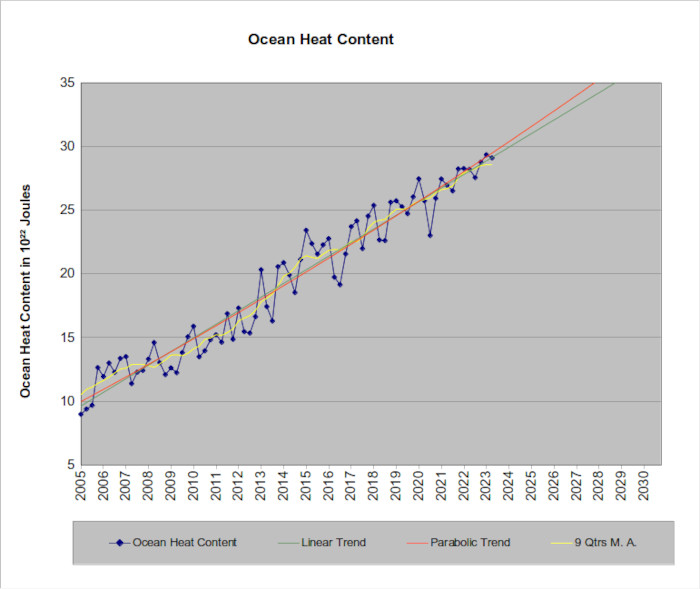
The graph above shows the Ocean Heat Content as measured by the Argo buoy system (red line in the previous graph) up through Aug. 2023. (Data available at http://www.nodc.noaa.gov/OC5/3M_HEAT_CONTENT/basin_data.html ) The slope of the green trend line shows us how fast the oceans are warming.
As of Aug., 2023 the warming rate (green line) is:
1.03E22 Joules per year
= 5.2 Hiroshima Atomic Bombs per second
= 3.25 trillion 100-watt light bulbs running 24/7.
= 406 100-watt light bulbs for each of the 8,000,000,000 people on planet earth
all running 24/7.
Now calculate your electric bill.
Note: The relatively short time span involved for the above data means that the calculation for the warming trend will be subject to variations (possibly +/- 10% in the slope) as new data becomes available , but the long term warming trend is expected to become even steeper.
Conclusion: Global Warming did not stop in 1998.
The PDO and the
Rate of Atmospheric Temperature Rise
The rate that atmospheric temperatures rise is a complex function that includes all possible components. One of these components is the Pacific Decadal Oscillation. A detailed description of the PDO can be seen here. https://www.ncdc.noaa.gov/teleconnections/pdo/
Ocean currents in the Pacific Ocean are known to undergo small changes depending on the positive or negative state of the PDO.
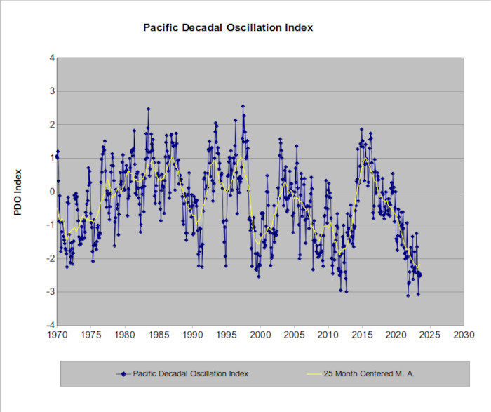
The chart above shows the PDO Index starting with 1970. Data for the chart can be seen at: https://www.ncdc.noaa.gov/teleconnections/pdo/ Note that the PDO was mostly negative for the 30-year period before 1970.
The PDO appears to be a way of measuring the mixing rate between surface water and deep water in the Pacific Ocean. When the PDO Index is predominately positive, there appears to be less mixing of surface and deep water in the Pacific Ocean. This allows rapid surface warming. (Including the air in contact with it.)
When the PDO is positive, atmospheric temperatures rise rapidly in response to carbon dioxide forcing.
When the PDO is predominately negative, it means that the mixing rate between surface and deep water in the Pacific Ocean is greater. An increased amount of warm surface water sinks deeper into the ocean and an increased amount of colder deep water rises to replace it. (This frequently shows up as a La Nina episode.) This colder water cools the air that is in contact with it. When the PDO is negative, global warming as measured by atmospheric temperatures proceeds at a slower rate because more of the carbon dioxide forced heating goes into the deep ocean instead of the atmosphere.
Global warming is going to continue no matter what state the PDO is in. The PDO just controls where the heat is going.
The Satellite
Temperature Record
Satellites can measure “brightness” microwave radiation which can be translated into temperatures. What the satellites lack in surface detail is offset by their ability to quickly observe the whole world. However, there are known problems when satellites are used to try to determine long term climate changes. The many “revisions” that appear in the satellite record attest to continuity problems that have yet to be satisfactorily resolved. (See “A little caution should be used . . .” below)
Remote Sensing Systems (RSS) is one of the organizations that interpret satellite microwave radiation (observed via NASA’s satellites) to try to calculate global temperatures for various levels in the atmosphere. The troposphere is the lowest layer in the atmosphere as it extends from the earth’s surface to about 7 miles up. (Varies with latitude and season) This is the layer where virtually all the earth’s weather occurs.
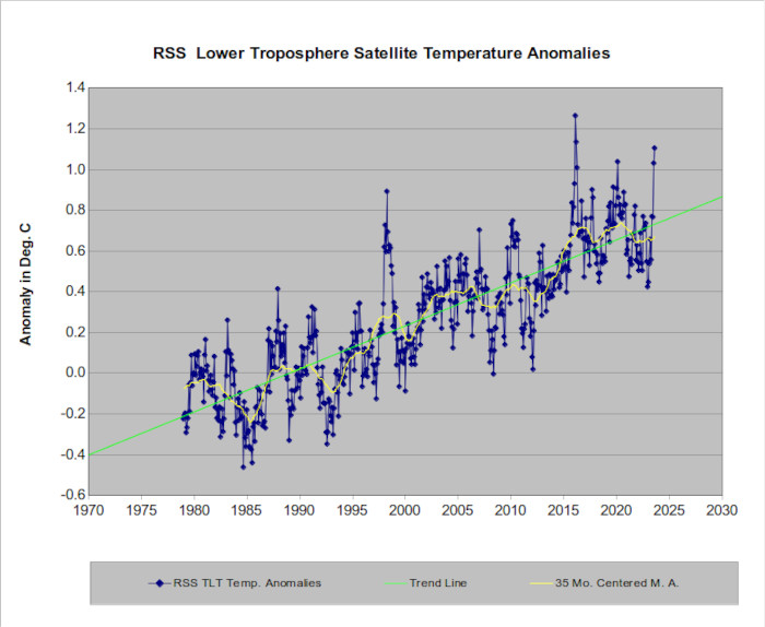
The chart above displays lower tropospheric temperature anomalies as interpreted by Remote Sensing Systems.
Data source: The “-82.5/82.5” column at: ( Link )
The warming rate as measured by the least squares trend line is 0.222 degrees C per decade.
The University of Alabama – Huntsville also uses NASA’s satellites to monitor global temperatures. The graph below shows what has been observed up through Aug. 2023.
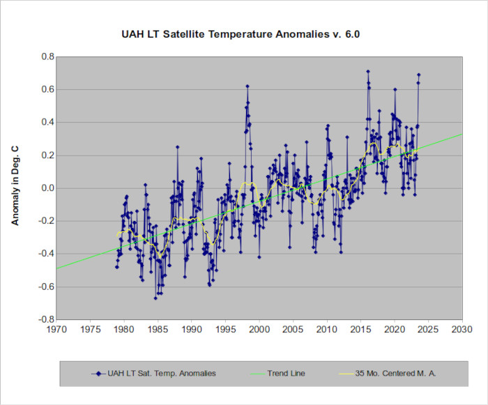
Slope = 0.192 degrees C. warming per decade.
The data source for the above graph is the “Globe” column at:
https://www.nsstc.uah.edu/data/msu/v6.0/tlt/uahncdc_lt_6.0.txt
Alternate source:
http://www.ncdc.noaa.gov/monitoring-content/sotc/upper-air/msu/uahncdc.lt
It should be noted that the adjustments to UAH data by Roy Spencer and John Christy (both Global Warming Deniers) result in a calculated warming rate that is anomalously low (and thus an outlier) when compared with other methods of measuring lower tropospheric temperature changes. Radiosondes (Weather Balloons) are much more accurate for multiple reasons. Past errors in UAH measurements are documented at: https://en.wikipedia.org/wiki/UAH_satellite_temperature_dataset
A little caution should be used regarding all satellite temperature measurements. Satellite observations are most useful for observing short term events, but there are multiple intrinsic problems if they are used for temperature observations over multi-year periods.
From Wikipedia:
“Satellites do not measure
temperature. They measure radiances in various wavelength bands,
which must then be mathematically inverted to obtain indirect
inferences of temperature. The resulting temperature profiles
depend on details of the methods that are used to obtain
temperatures from radiances.”
“The satellite time series is not homogeneous. It is constructed from a series of satellites with similar but not identical sensors. The sensors also deteriorate over time, and corrections are necessary for orbital drift and decay. Particularly large differences between reconstructed temperature series occur at the few times when there is little temporal overlap between successive satellites, making intercalibration difficult.”
“The satellite time series is not homogeneous. It is constructed from a series of satellites with similar but not identical sensors. The sensors also deteriorate over time, and corrections are necessary for orbital drift and decay. Particularly large differences between reconstructed temperature series occur at the few times when there is little temporal overlap between successive satellites, making intercalibration difficult.”
https://en.wikipedia.org/wiki/Satellite_temperature_measurements
Satellite temperature measurements are helpful, but they are not as accurate as surface measurements using “old fashion” thermometers (which are easy to calibrate). As stated on the Remote Sensing Systems website:
“A similar, but stronger case can
be made using surface temperature datasets, which I consider to
be more reliable than satellite datasets (they certainly agree
with each other better than the various satellite datasets
do!).”
http://www.remss.com/blog/recent-slowing-rise-global-temperatures
More technical explanations of satellite observational problems can be found at: ( Link )
and
http://www.remss.com/measurements/upper-air-temperature#Uncertainty
One of the recent claims by Global Warming Deniers is that satellite temperature measurements are more accurate than surface temperature measurements. This is another fabrication by Global Warming Deniers.
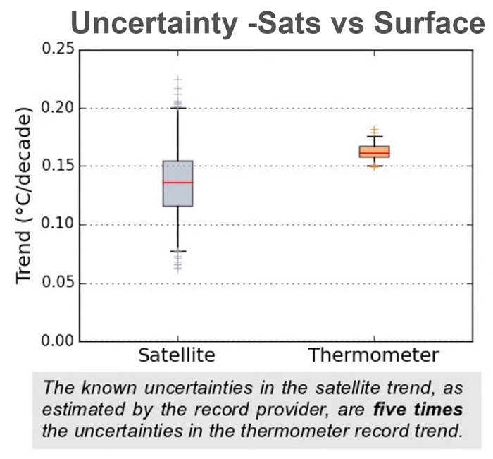
As can be seen in the chart above, satellite temperature measurements have 5 times the error as surface temperature measurements. For a detailed explanation please see http://www.skepticalscience.com/Satellite-record-vs-thermometers.htm
and/or
http://www.skepticalscience.com/surface_temperature_or_satellite_brightness.html
Also please see the video at https://www.youtube.com/watch?v=8BnkI5vqr_0 where Carl Mears (Senior scientist at Remote Sensing Systems) explains the problems involved with satellite observations and presents the above chart at 2:11 into the video.
For more information, please see:
YALE Climate Connections
“How Reliable are Satellite Temperatures?”
https://www.youtube.com/watch?feature=player_embedded&v=UVMsYXzmUYk
It is interesting to compare what the real temperature record has been and the real CMIP5 forecasts were vs. the fabricated temperature record and fabricated CMIP5 forecasts that Global Warming Deniers publish.
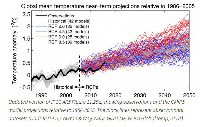
The chart above was posted on the UK's Climate
Lab Book web page.
https://www.climate-lab-book.ac.uk/comparing-cmip5-observations/
The chart above shows various CMIP5 forecasts vs. actual temperatures. The low RCP runs (blue lines) assume that immediate sharp reductions are made in carbon dioxide emissions. The high RCP runs (red lines) assume a rapid expansion of carbon dioxide emissions. The middle RCP runs are various combinations that are closer to "business as usual". All the CMIP5 runs throw in random short term variations to simulate statistical "noise".
We see that 2017 temperature anomalies are "right down the middle" from what was forecast over 10 years ago. The CMIP5 model has accurately forecast what has actually occurred.
But Global Warming Deniers can not live with reality. They fabricate an Alternate Reality. In their Alternate Reality, they lie about what has actually happened. They fabricate their own "facts".
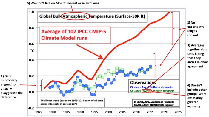
The following graph was originally created by John Christy. Annotations have been subsequently added to show some of the things that are wrong with the Chart.
In John Christy's chart (below), CMIP5 forecasts exceed 1.0 degrees C of warming before 2025. The actual average warming forecast by CMIP5 (above) is less that 1 degree C as of 2025. John Christy lied about the CMIP5 forecasts.
For additional information on how Roy Spencer and John Christy willfully misrepresent satellite data, please see “Republicans' favorite climate chart has some serious problems”
( Link )
First, actual atmospheric temperatures have warmed by about one deg. C since 1975. (Please see the "NOAA/NCDC Land/Sea Monthly Temperature Anomalies" chart that is displayed above.) This is virtually an exact duplication of the CMIP-5 forecast shown by the red line line in the above chart. This is a much faster warming rate than the fabricated slower rate that Christy shows in his chart.
It also appears that the “Denier’s” chart (above) misrepresents the weather balloon observations (see below). Global Warming models predict warming in the lower atmosphere (troposphere) and cooling in the upper atmosphere (stratosphere). This is exactly what has been observed.
The “Denier’s” chart appears to have averaged the two regions (“Circles – Avg. 4 balloon datasets”) which gives a much slower rate of “total” warming.
If you check the balloon observations (below) that show the lower half of the atmosphere, the average warming amount from the late 1970s to 2015 is close to 1 degree C. This is exactly what the models were predicting.
Also, if you check the label at the top of Christy’s chart, Christy has included temperature readings up to 50,000 feet. 50,000 feet up is in the stratosphere – which is cooling as predicted by global warming models. Thus Christy has averaged stratospheric cooling with lower tropospheric warming to get a “slower warming rate”.
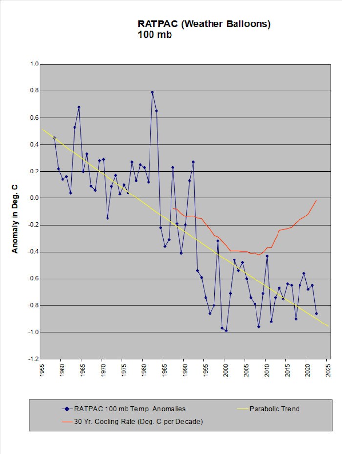
The chart above shows the temperature anomalies at the 100 millibar level in the atmosphere. (Averages a little over 50,000 feet above sea level.) Data source: 100 mb column in the Globe section at:
http://www1.ncdc.noaa.gov/pub/data/ratpac/ratpac-a/
Please see the pressure < --- > altitude converter at http://weatherfaqs.org.uk/book/export/html/174 to convert pressure in millibars to altitude above sea level. Note that the standard elevation for the top of the troposphere is 36,091 feet. The stratosphere begins above this level. Thus when Spencer and Christy include the next 14,000 feet above 36,091 feet, they are willfully including stratospheric temperatures. And global warming calculations have always (and accurately) forecast that the stratosphere would cool due to increased carbon dioxide content.
Christy then compares this “slight-of-hand” slower warming rate with the expected much faster warming rate near and at the earth’s surface. He then claims that the warming rate hasn’t kept up with the warming rate forecast by the computer models. He then claims that this (deceitful) warming rate “proves” that the computer models (which are just numeric calculations that use known laws of physics) are wrong/worthless.
It would appear that some of the serious problems of the “Republicans' favorite climate chart” include Willful Misrepresentation of the Data.
Full Definition of
FRAUD
1 a : DECEIT, TRICKERY; specifically : intentional perversion of truth in order to induce
another to part with something of value or to surrender a legal right
b : an act of deceiving or misrepresenting : TRICK
2 a : a person who is not what he or she pretends to be : IMPOSTOR; also : one who
defrauds : CHEAT
b : one that is not what it seems or is represented to be
http://www.merriam-webster.com/dictionary/fraud
As for Christy’s analytical forecasting ability . . .
From Discover Magazine in Feb. 2001:
“Christy thinks it equally likely that the Earth's surface will cool.”
http://discovermagazine.com/2001/feb/featgospel
“Christy has been wrong for decades”
( Link )
“Over the years, Spencer and Christy developed a reputation for making serial mistakes that other scientists have been forced to uncover.” ( Link )
Please see
https://en.wikipedia.org/wiki/UAH_satellite_temperature_dataset#Corrections_made
for the long history of:
"The table below summarizes the adjustments that have been applied to the UAH TLT dataset."
"The largest of these errors was demonstrated in a 1998 paper by Frank Wentz and Matthias Schabel of RSS."
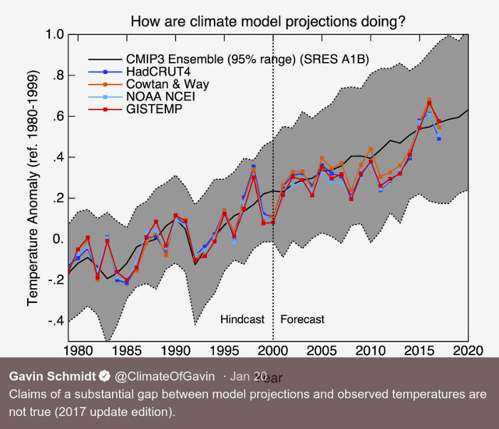
The chart above was posted on Gavin Schmidt's Twitter page. ( Link )
The chart shows actual temperature anomalies as observed and recorded by several measuring methods vs. the old CMIP3 model. In the real world (not Spencer and Christy's alternate reality), the earth is warming just the way the climate models have been forecasting.
NASA has a similar chart with an update for 2019.
Study Confirms Climate Models are Getting Future Warming Projections Right
Weather Balloons
NOAA/NCDC (National Climate Data Center) also keeps temperature records as measured by weather balloons. Altitudes above sea level vary from sea level to 30 mb (high in the stratosphere).
The chart below shows temperature anomalies at the 850 mb level. (About 4,500 to 5,000 feet above sea level which is in the lower troposphere.)
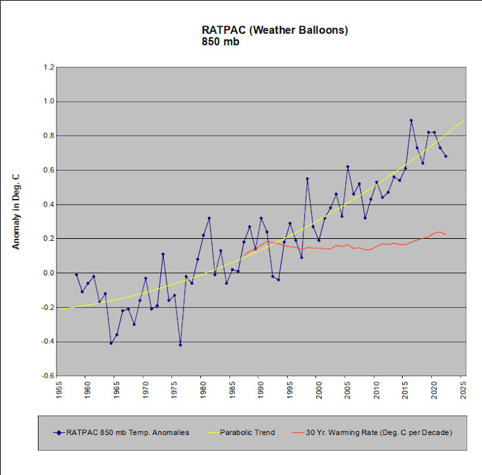
The chart above shows temperature anomalies at the 850 mb level as measured by weather balloons (Radiosonde Atmospheric Temperature Products for Accessing Climate (RATPAC))
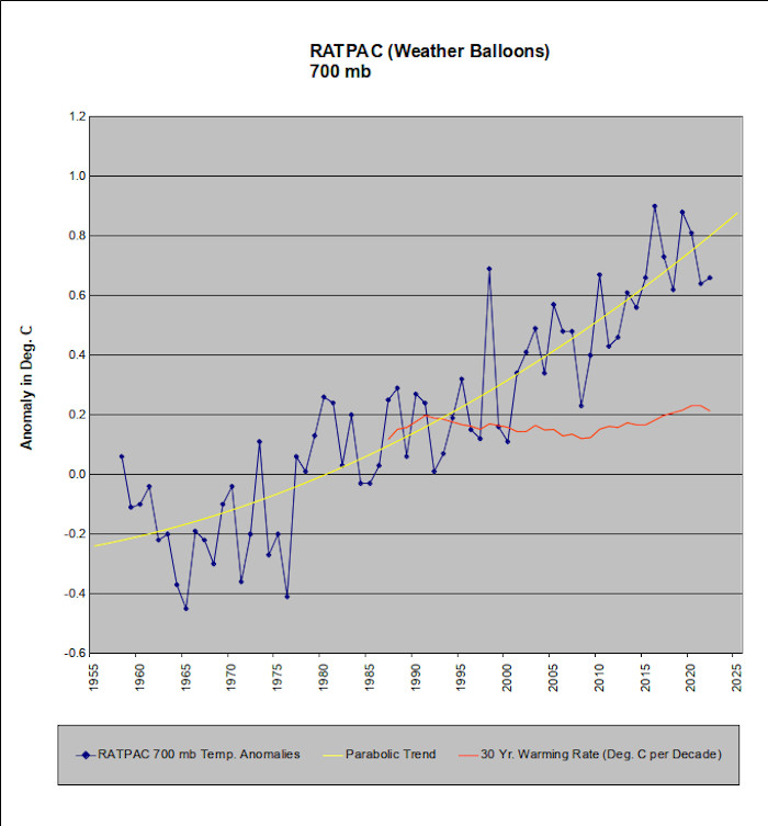
The chart above shows temperature anomalies at the 700 mb level (about 9,500 to 10,000 feet above sea level) as measured by weather balloons (Radiosonde Atmospheric Temperature Products for Accessing Climate (RATPAC))
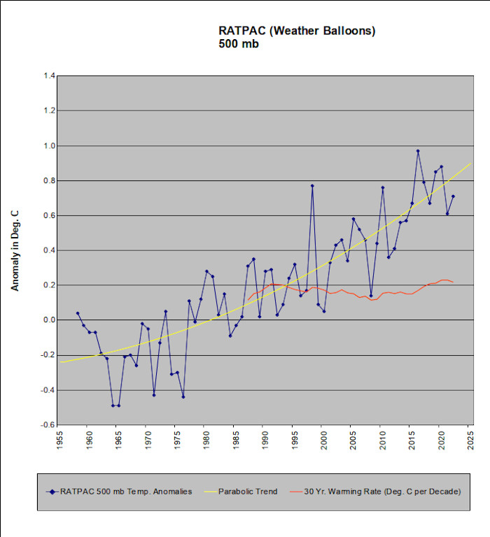
The chart above shows temperature anomalies at the 500 mb level (about 18,000 to 18,500 feet above sea level) as measured by weather balloons (Radiosonde Atmospheric Temperature Products for Accessing Climate (RATPAC)). The 3 charts show the 3 standard pressure levels for the lowest 1/2 of the atmosphere. (Lower Troposphere)
The description for the above charts can be found at: ( Link )
If you follow a couple of links at the above webpage, you can access the source data for the above charts. It's the 850 mb, 700mb, and 500 mb data in the “Globe” section at:
http://www1.ncdc.noaa.gov/pub/data/ratpac/ratpac-a/
Of note: The 1998 temperature spike that shows up in the satellite data can also be seen in the 700 mb and 500 mb charts. The El Nino that occurred that year forced “wet adiabatic” lapse rates over equatorial regions that replaced the more normal “dry adiabatic” rates. This led to relatively higher temperatures at the 700 and 500 mb levels. (The “adiabatic rate” at any given location describes the rate that a parcel of air would cool if you lift it from sea level to higher elevations. Wet adiabatic rates cool more slowly since heat is released due to water vapor condensation. Thus “slower cooling” produces air that is less cold than what happens with “faster cooling”.)
Also of note: The 3 charts above illustrate the warming that has taken place in the lower troposphere. They are consistent with the warming rate shown by the RSS satellite interpretation of the warming rate. Roy Spencer's interpretation as shown in the UAH satellite temperature anomalies is NOT consistent with these radiosonde measurements. But then again, Global Warming Denier Roy Spencer has "adjusted" his results to come closer to his denial agenda.
As can be seen in the charts, weather balloon data confirms that Global Warming didn’t stop in 1998.
The actual
temperature record vs. projections / forecasts by the real
models
Earlier we looked at one of the fabricated CMIP-5 charts that Global Warming Deniers tout. As stated at the top of this page, “Global Warming Deniers claim that Global Warming is a hoax/fraud/scam. They lie, they are willfully ignorant, and they are wrong.”
It is worthwhile comparing actual temperature observations vs. the real CMIP-5 / IPCC projections.
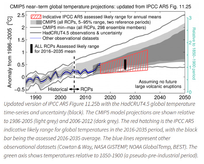
The chart above was posted on the UK's Climate Lab Book web page.
https://www.climate-lab-book.ac.uk/comparing-cmip5-observations/
As stated on the page:
This page is an ongoing effort to compare observations of global temperature with CMIP5 simulations assessed by the IPCC 5th Assessment Report.The chart above shows the actual temperature record as recorded by HadCRUT5 as well as projections by the IPCC and the CMIP5 computer model ensemble. ( http://cmip-pcmdi.llnl.gov/cmip5/index.html )
Instead of actual temperatures not living up to what the models had predicted, we see that up through 2016, global temperatures were running at the upper end (warmer than) of what was forecast. In the real world, Global Warming (and all of its expected consequences) is perhaps running faster than what was expected.
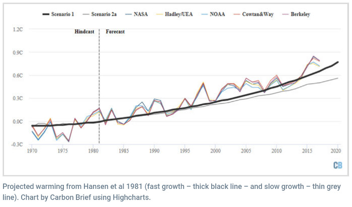
The picture above shows James Hansen's Global Warming forecast made in 1981 vs. what has happened since. Graph source: ( Link )
The lesson to be learned is that Global Warming Deniers fabricate their “facts”. If you want the real facts, check a reliable source.
Radiative Forcing
The reason that global warming is occurring is that human activities have modified the earth’s ability to radiate heat back out into space. The requirement for the earth’s temperature to remain constant is that incoming solar energy (“solar irradiance”) must be balanced by a combination of reflection of this incoming solar radiation and outgoing long wave heat radiation. If incoming solar radiation is relatively constant (and it is), but outgoing heat radiation is reduced, then the earth will warm until rising temperatures (which increase outgoing radiation) can establish a new temperature equilibrium.
Human activities have changed the earth’s ability to radiate heat. Since the beginning of the industrial revolution, combustion of fossil fuels (natural gas, oil, and coal) have increased the atmospheric content of carbon dioxide by over 40%. Carbon dioxide slows the earth’s ability to radiate heat into space. Carbon dioxide and multiple other human generated components have altered the heat balance that existed before the industrial revolution.
This imbalance caused by human activities is called “Radiative Forcing”. That chart below illustrates the various components of climate forcing, and shows the changes in the net magnitude of this forcing since 1750.
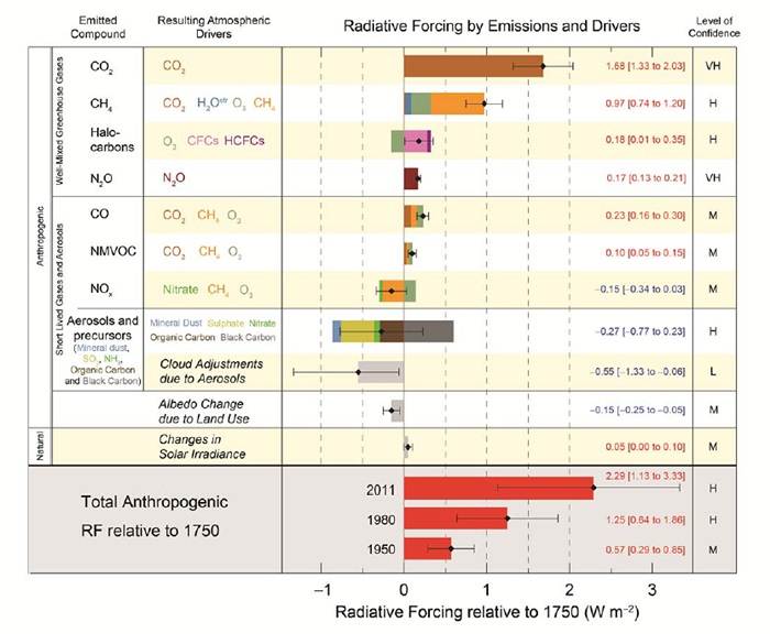
The chart above is part of the “Summary for Policymakers” section of the IPCC’s AR5 report. The top portion shows the various components and the magnitude of their forcing. The bottom portion shows the increasing amount of forcing for various years as measured against what existed in the year 1750.
The “Solar” component is of interest. Global Warming Deniers try to sidestep the issue by blaming the sun for global warming. The change in irradiance from the sun is negligibly small compared to 1750 values, and has actually decreased since the mid-1980s. Thus Global Warming Deniers are wrong again when they claim the sun is responsible.
As a technical note, notice that all the molecules listed under “Resulting Atmospheric Drivers” have 3 or more atoms in each molecular compound. Molecules that have 3 or more atoms are capable of absorbing (and reradiating) long-wavelength heat radiation while ordinary atmospheric oxygen (O2) and nitrogen (N2) form molecules with only 2 atoms each. Molecules that only have 2 atoms do not absorb long-wavelength radiation (the radiation at ordinary temperatures). Thus ordinary oxygen and nitrogen which compose most of the content of the atmosphere are not directly involved in the earth’s heat budget.
Overall, forcing is increasing and, most likely, will continue to increase for many decades into the future. Other feedback factors such as increased water vapor in the atmosphere are only beginning to kick in, and will become much stronger in the future. The continuing increase in forcing supports the observation from oceanic heating (shown earlier) that total global warming is accelerating. Planet earth will be a much different place by the time temperatures warm enough to reestablish thermal equilibrium.
Other Confirming
Observations that Global Warming is Continuing
Source:
Switzerland’s World Glacier Monitoring Service
https://wgms.ch/global-glacier-state/
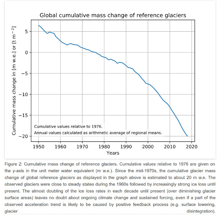
The chart above shows what is happening to the world’s glaciers. They are melting! Not only are the world’s glaciers shrinking, the shrinkage rate has accelerated in recent years.
As for the false claims by the Deniers that glaciers in the Himalayas are advancing, a detailed study that analyzed 7,090 glaciers in central Asia (including the Himalayas and Karakoram) and that was published in 2012 ( http://www.nature.com/nclimate/journal/v2/n9/full/nclimate1580.html ) found that:
“The total glacier area of 7,090
glaciers has decreased from 13,363.5 km2 to 12,130.7
km2 in the period between the 1970s and 2000s.” http://www.nature.com/nclimate/journal/v2/n9/extref/nclimate1580-s1.pdf
(Page 3)
For more information (including then and now photos) about “The Mighty Himalayan Glaciers are Vanishing”, please see http://www.glacierworks.org/ .
There’s also a 75 minute video “Rivers of Ice: Vanishing Glaciers of the Greater Himalaya” at http://research.microsoft.com/apps/video/default.aspx?id=171318
Alternately, please see ( Link ) for a “Poster Child” example of a Global Warming Denier lying about the Himalaya’s Melting Glaciers.
Also, please see:
“Science News”
“Study: Mount Everest losing its cloak of ice and snow as world warms” ( Link )
and
Also please see:
“Multi-decadal mass loss of glaciers in the Everest area (Nepal Himalaya) derived from stereo imagery”
http://www.the-cryosphere.net/5/349/2011/tc-5-349-2011.pdf
“We reveal that the glaciers have been significantly losing mass since at least 1970, despite thick debris cover. The specific mass loss for 1970–2007 is 0.32±0.08mw.e. a−1”
(mw.e. a-1 = meters of water equivalent per annum(year))
The world’s glaciers did not stop melting after 1998.
NASA has independently measured that the world’s glaciers are melting. How about 4.3 trillion tons of melting from 2003 to 2010?
http://www.nasa.gov/topics/earth/features/grace20120208.html
If global warming stopped in 1998, what melted 4.3 trillion tons of ice?
Argentina’s
Upsala Glacier 2003 to 2011
The Upsala Glacier is one of the larger outflow glaciers from the Southern Patagonia Icefield. The two pictures below were generated by Google Earth. The yellow line was generated by Google Earth’s distance measuring tool, and is over two miles long. The small blue squares show where people have taken photographs.
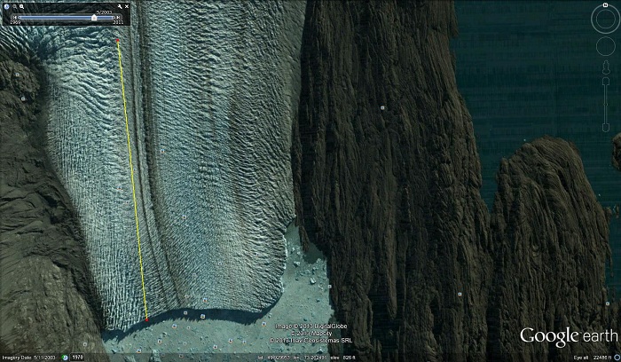
The picture above shows the Upsala Glacier as of May 11, 2003.
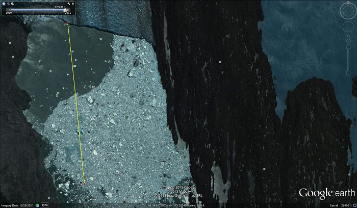
The picture above shows the Upsala Glacier as of Dec. 28, 2011. Icebergs and many smaller ice fragments are floating on a lake which now occupies the former location of the glacier.
If Global Warming stopped in 1998, what caused the Upsala Glacier to melt back over 2 miles from 2003 to 2011?
Alaska’s Columbia
Glacier
The first two pictures below are from NASA's Earth Observatory.
http://earthobservatory.nasa.gov/Features/WorldOfChange/columbia_glacier.php
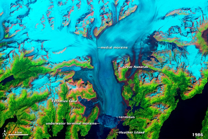
The first picture shows Alaska’s Columbia Glacier as of 1986.
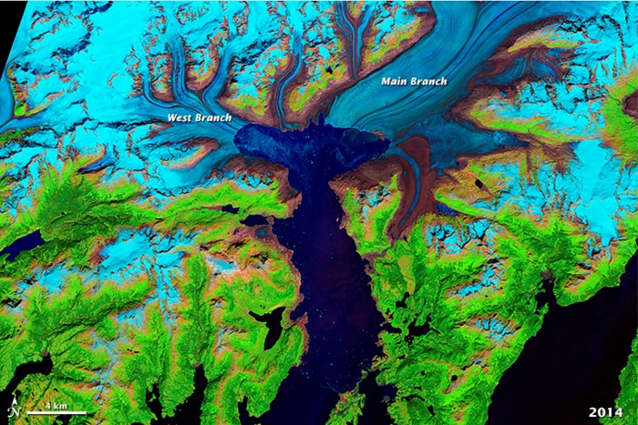
This next picture shows the Columbia Glacier as of 2014.
Finally, this third picture shows a Google Earth view of the same area. Google Earth’s distance measuring tool has been used to show that the glacier has melted back 11 miles. (Yellow line.)
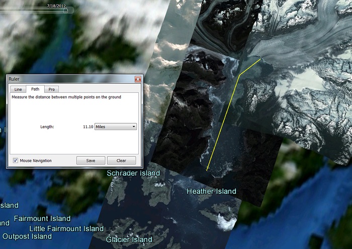
If Global Warming stopped in 1998, what melted 11 miles of the Columbia Glacier after 1998?
Polar Sea Ice
Extent
Another “claim” by Global Warming Deniers is that Polar Sea Ice Extent is expanding. Again, this is another Lie.
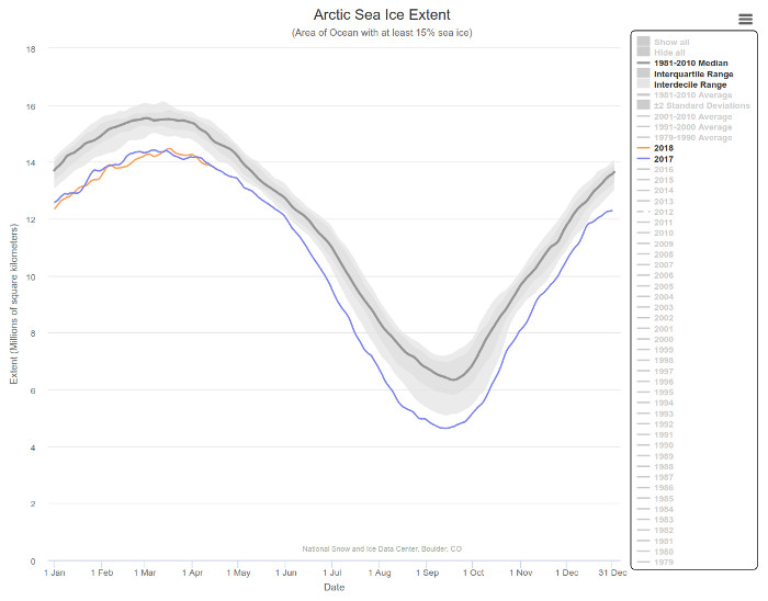
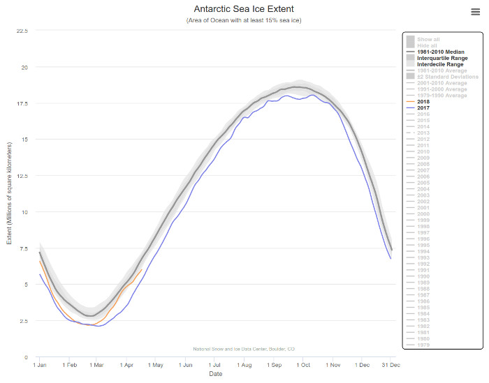
The above graphs are from the National Snow and Ice Data Center.
http://nsidc.org/arcticseaicenews/
The top graph shows Arctic ice extent for 2017 (blue) and the first few months of 2018 (orange) vs. the 1981 to 2010 median (gray line). The bottom graph shows Antarctic ice extent for the same period.
In the Arctic, 2017 and 2018 set the two lowest all time lows for the least amount of sea ice ever recorded for the winter season. In the Antarctic, 2017 set an all time record low sea ice extent ever seen in any month.
If Global Warming stopped in 1998, why is sea ice extent setting record lows?
Sea Level is
Rising
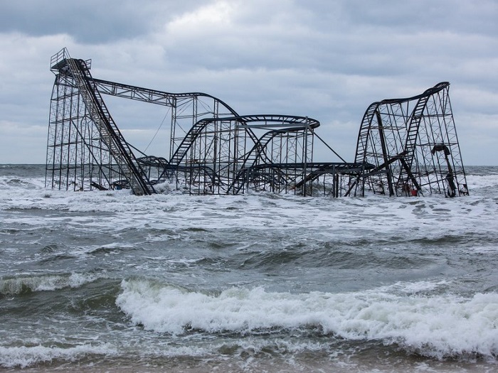
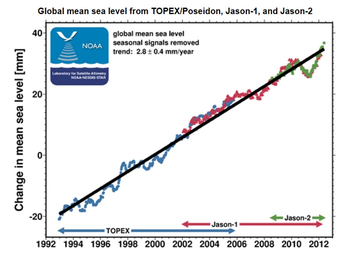
The chart above shows what is happening to sea level. As the world warms, sea level rises due to thermal expansion plus water from melted glacial ice. The most recent data at http://ibis.grdl.noaa.gov/SAT/SeaLevelRise/LSA_SLR_timeseries_global.php indicates this rate of sea level rise is continuing to accelerate beyond what was observed up through 2011.
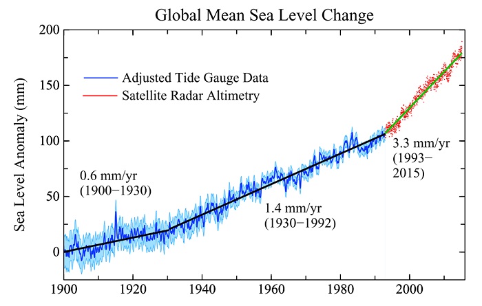
The chart above is a copy of what can been seen at Columbia University’s web page at http://www.columbia.edu/~mhs119/SeaLevel/ . The rate of sea level rise has quintupled since the 1900 to 1930 period.
“So-called "nuisance flooding" -- which causes public inconveniences such as frequent road closures, overwhelmed storm drains, and compromised infrastructure -- has increased on all three U.S. coasts, between 300 and 925 percent since the 1960s”
http://www.noaanews.noaa.gov/stories2014/20140728_nuisanceflooding.html
And for the last 10 years, the rate of sea level rise has accelerated to over 4 mm/yr.
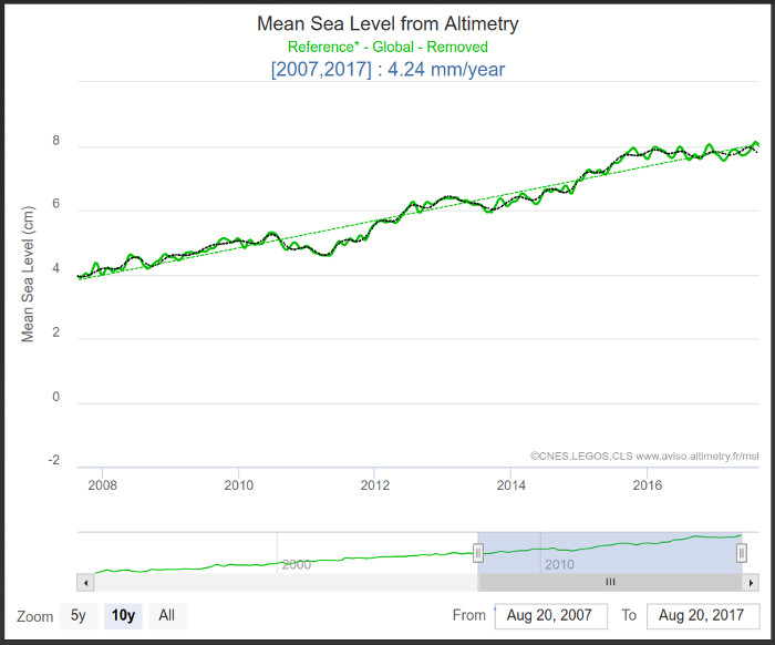
The chart above is from https://www.aviso.altimetry.fr/index.php?id=1599
2019 update: As of the 10 year period ending in July 2019, the 10 year rate of sea level rise has increased to 4.45 mm/yr - and the rate of sea level rise is continuing to accelerate.
If global warming stopped in 1998, what is causing sea level to rise?
Holland Island
and Sea Level
Holland Island is one of the famous (and a bit sad) stories of sea level rise.
http://www.sciencedirect.com/science/article/pii/S0959378005000579
http://sometimes-interesting.com/2013/04/08/the-last-house-on-holland-island/
In 1900 Holland Island had a population of 253. Today, due to sea level rise and subsidence, there is nothing left standing.
(Click on image for a large version)
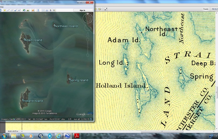
A 2013 Google Earth view of the Holland Island area is shown on the left along with an 1898 map on the right. Since 1898, Long Island and the unnamed islet north of it are gone. The north end of Adam Island has been submerged to where only a few sand bars are left.
The north to south peninsula that used to exist on the southwest side of Holland Island no longer exists. The marshy peninsula on the southeast side of Holland Island is also gone. The northern peninsula that extended nearly to Adam Island has been reduced to a few sand bars. This is where the “Last House on Holland Island” stood until 2010. It is now gone.
Sea level is expected to rise 20 feet over the next 1,000 years. (See “Eemian interglacial” in the next section (below)) This is enough to submerge major coastal cities including Miami and New Orleans. Over the next 1,000 years these and other cities will gradually be abandoned just as Holland Island has been abandoned. Sometime between now and 1,000 years from now, there will be a “Last Building in Miami”. 1,000 years from now, it too will be gone.
And long before the land is submerged, the millions of septic/sewage systems will no longer function. (Oh S _ _ _ – All over your backyard)
The process of abandonment will be gradual salt water intrusion which will rot building foundations and destroy fresh water supplies. (Throw in a hurricane or two for good measure.) Taxes will gradually/relentlessly be increased for public works programs to try to protect what is left. The current population will try to hold out, but future generations will understand what is happening. They will decide to live somewhere else.
USGS study for Miami-Dade County: “The results of the study indicate that as of 2011 [from 1995 to 2011] approximately 1,200 square kilometers (km2) of the mainland part of the Biscayne aquifer were intruded by saltwater.”
http://pubs.er.usgs.gov/publication/sir20145025
Isle de Jean
Charles, Louisiana
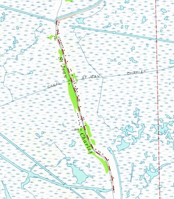
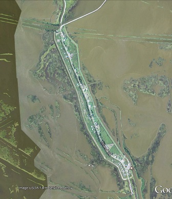
The inhabitants of Isle de Jean Charles, LA are being forced to relocate as a result of rising sea level. The map on the left is a USGS map using 1963 data. The land surrounding Isle de Jean Charles was a marsh – but it was land.
The right-hand view is via Google Earth. Marshy areas are now just muddy water. It won’t take very many more years until Isle de Jean Charles is also “just muddy water”.
Ditto for New Orleans.
Ditto for Miami.
North Topsail
Beach, North Carolina
The three pictures below give an idea of what is happening and what will continue to happen to beachfront property around the world.
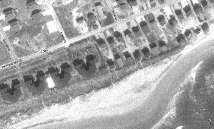
The picture above is a Google Earth view of the seashore in North Topsail Beach, NC as of 1993.
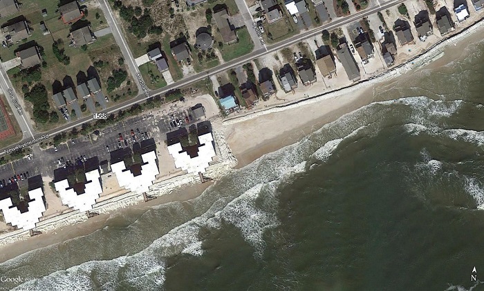
The picture above is a Google Earth view of the same area, but as of 2015.
Q: What has changed in the intervening years?
A:
1) The beachfront in front of the
condos (lower left) is gone.
2) The beachfront and first row of beach homes to the right of the condos are gone.
3) Walls of sandbags have been placed in front of what is left to try to postpone the inevitable.
2) The beachfront and first row of beach homes to the right of the condos are gone.
3) Walls of sandbags have been placed in front of what is left to try to postpone the inevitable.
And what has happened to property values of the remaining homes in North Topsail Beach?
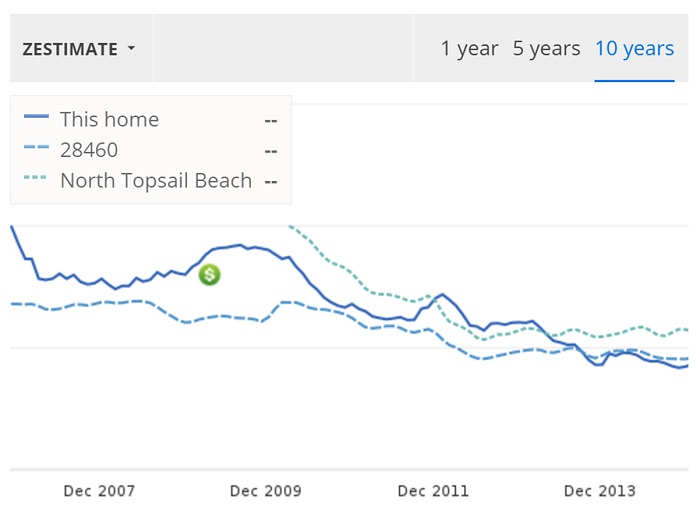
The picture above is Zillow’s ( http://www.zillow.com/ ) estimate of the value of the house with the blue roof as well as values for all homes in the North Topsail area.
Global Warming Deniers are invited to invest their savings in North Topsail Beach real estate.
Christchurch, New Zealand
In the United States, Global Warming Denialism has prevailed, and people in general downplay the expected effects of rising sea level. However, in other parts of the world, rationality prevails.
The people in Christchurch New Zealand understand what is happening. They are exercising a “Managed Retreat” from low areas that will inevitably be submerged by rising sea level. For the homeowners involved, the phrase “Managed Retreat” is an euphemism for “Forced Relocation”.
The three pictures below show the results of the “Managed Retreat’ in the eastern suburbs of Christchurch, New Zealand.
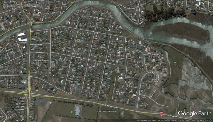
The picture above is a 2004 Google Earth view of a residential area some 4.5 miles ENE of downtown Christchurch New Zealand. Hundreds of homes can be seen.

The picture above shows the same area, but as of 2015. The forced exodus has begun.
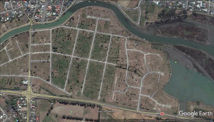
The picture above shows the same area, but as of 2017. The forced exodus is nearly complete. Thousands of people in New Zealand have been forced to move due to rising sea level. Over 7,000 homes no longer exist. ( Link )
The count will become millions when the rest of the world is considered.
Here is an official analysis:
Preparing New Zealand for rising seas
http://www.pce.parliament.nz/media/1390/preparing-nz-for-rising-seas-web-small.pdf
The 800,000 Year
Historical Carbon Dioxide Record
NOAA’s Earth System Research Laboratory has an animation video at http://www.esrl.noaa.gov/gmd/ccgg/trends/history.html that shows the historical record of what humans are doing vs. what “Nature” does. The chart below is a print screen image from this video.
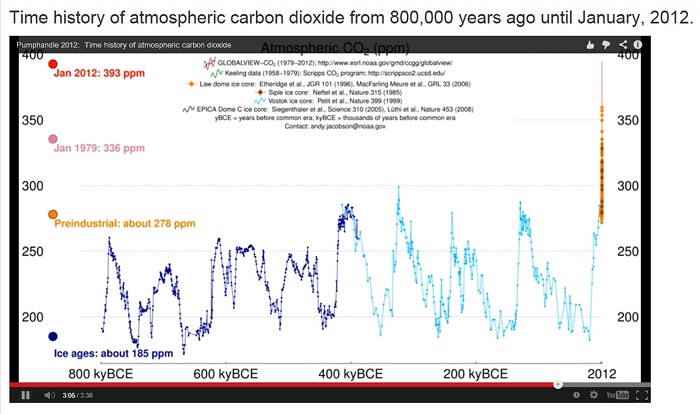
The near vertical line at the right end of the graph shows what human activities have done in the last few decades. The atmospheric concentration of carbon dioxide due to human activities continues to accelerate upwards.
In the Eemian interglacial that peaked about 125,000 years ago, sea level rose so that the nearest land to what is now Miami, FL was some 35 to 40 miles away. What do you suppose will happen when glacial melting and thermal expansion of the oceans catches up to what we have already done?
What is Going to
Happen to Sea Level?
The picture below shows a diagram that was published in the July 2015 issue of Science Magazine.
(“The World’s Leading Journal of Original Scientific Research”)
“Sea-level rise due to polar ice-sheet mass loss during past warm periods”
http://www.sciencemag.org/content/349/6244/aaa4019.abstract
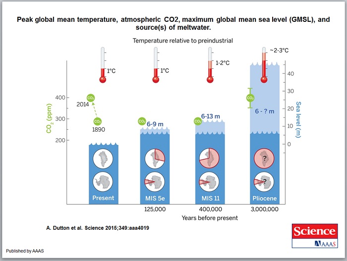
The diagram shows:
“Peak global mean temperature, atmospheric CO2, maximum global mean sea level (GMSL), and source(s) of meltwater.
Light blue shading indicates uncertainty of GMSL maximum. Red pie charts over Greenland and Antarctica denote fraction (not location) of ice retreat.”
In the Eemian Interglacial that peaked about 125,000 years ago, sea level was some 6 to 9 meters (20 to 30 feet) higher than current levels. This occurred even though maximum carbon dioxide levels were well below what we have now. The right portion of the diagram shows what is expected to happen when warming and glacial melting catch up to current carbon dioxide levels. What is going to happen with future levels of carbon dioxide?
A Typical Example
of a GWD “Source” for the “Stopped” Lie
On Oct. 13, 2012 a British Global Warming Denier tabloid (the “Mail Online”) ran a story with the following headline:
“Global warming
stopped 16 years ago,
reveals Met Office report quietly released...
and here is the chart to prove it”
( Link )
reveals Met Office report quietly released...
and here is the chart to prove it”
( Link )
The author of the article (David Rose) has a history of willful misrepresentations of reality. But then again, neither David Rose nor his tabloid audience are interested in factual evidence.
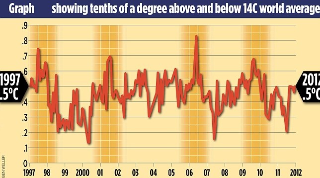
The story included the following chart:
In reality:
“Firstly, the Met Office has not issued a report on this issue.”
http://metofficenews.wordpress.com/tag/climate-research-unit/
Alternately
http://metofficenews.wordpress.com/2012/10/14/
Thus when the headline states that there was a report, it is just another Global Warming Denier lie.
The above graph (which has a “Ben Weller” label as a source) has been widely circulated in Global Warming Denier blogs on the Internet. The article contains no source reference for the “temperature data” in the graph. The origin and credibility for the chart data is unknown, and the only information we have is that the chart was authored by “Ben Weller”.
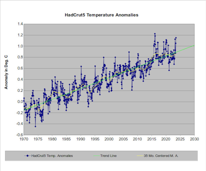
It’s instructive to compare the graph that was published in the Daily Mail’s “Mail Online” with the actual temperature record as compiled by the UK’s Climate Research Unit.
Slope = 0.211 degrees C. warming per decade.
The graph above shows the Hadley Climate Research Unit’s monthly temperature anomalies from 1970 to present. The data can be accessed and checked for accuracy at ( Link )
(Note: Old versions of the table are subject to minor changes as corrections and late data become available.)
The 35 month centered moving average (yellow line) is of interest. It shows that average temperatures beginning in Dec. 2001 have been consistently warmer than the warmest 35 month average that was seen in 1998. If global warming stopped in 1998, why have temperatures for the last 20+ years averaged warmer than what was observed in 1998?
In spite of what the Mail Online article claims, it is obvious that Global Warming didn’t stop in 1998.
The HadCRUT5 data can be easily traced to an actual temperature database. The Daily Mail “Mail Online” graph is attributed to “Ben Weller”.
Who or what is Ben Weller?
Google searches using
“Ben Weller” climate
“Ben Weller” meteorology
“Ben Weller” temperature
return links to various blogs/forums/websites that discuss the
article, but not to any source that would indicate that “Ben
Weller” works for any scientific organization. Conclusion: The
“Ben Weller” name on the chart does not refer to a scientific
organization.“Ben Weller” meteorology
“Ben Weller” temperature
There is a Ben Weller freelance photographer who has contributed work to the Daily Mail/Mail Online. The suspicion arises that Ben Weller has widened his repertoire to include fabricating “Graphic Arts”.
Addendum: I have subsequently received an email from the legitimate freelance photojournalist / university professor Ben Weller. He has confirmed that he did NOT have anything to do with the Daily Mail chart. Whoever fabricated the chart apparently also fabricated the “Ben Weller” authorship.
Since the chart has been widely circulated by Global Warming Deniers (A Google image search shows hits on over 25,000,000 web pages), it would appear that the freelance photojournalist/university professor Ben Weller is a victim of identity theft.
As for the Daily Mail’s/Mail Online’s “journalistic credibility”, you should realize that they devote a lot of attention to “features” such as:
UFOs

Bigfoot

etc.
Readers should understand that the Daily Mail/Mail Online (and most other publishers) will publish articles that are targeted toward a specific audience - including the audience’s (willfully ignorant) “intelligence” level.
The source data for the “Global Warming Stopped” headline is unknown. However, Global Warming Deniers are gullible, scientifically ignorant fools who will believe any LIE as long as it supports what they want to believe. Thus they fabricate a mysterious temperature record and then point to this fabricated temperature record as if it were true.
“Red Handed”
Evidence that Global Warming Deniers are Liars
The Mail Online/Daily Mail generously provides evidence that they print lies. Here is a Print Screen copy from the Mail Online’s web page on Sept. 19, 2013.
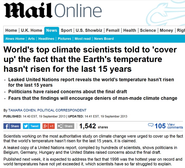
The Mail Online asserts “the fact that 1998 was the hottest year on record and world temperatures have not yet exceeded it”.
If we check the world’s temperature databases we find that:
1) GISS/NASA shows that 2005, 2007, and 2010 were all warmer than 1998.
http://data.giss.nasa.gov/gistemp/tabledata_v3/GLB.Ts+dSST.txt
2) NOAA/NCDC shows that 2005 and 2010 were warmer than 1998.
https://www.ncdc.noaa.gov/monitoring-references/faq/anomalies.php
3) HadCRUT5 shows that 2005 and 2010 were warmer than 1998.
http://www.cru.uea.ac.uk/cru/data/temperature/HadCRUT4-gl.dat
4) And the UAH satellite temperature graph (above) shows that global temperatures have been consistently above the 1998 moving average for the last 14 years.
The Mail Online is lying again when it states that 1998 was the warmest year on record. Then they fabricated a claim that there is a cover-up.
The top of this web page states that Global Warming Deniers “lie, they are willfully ignorant, and they are wrong.” The Mail Online is a perfect example demonstrating that Global Warming Deniers are liars.
Still Another
Willful Lie by David Rose & The Daily Mail/Mail Online
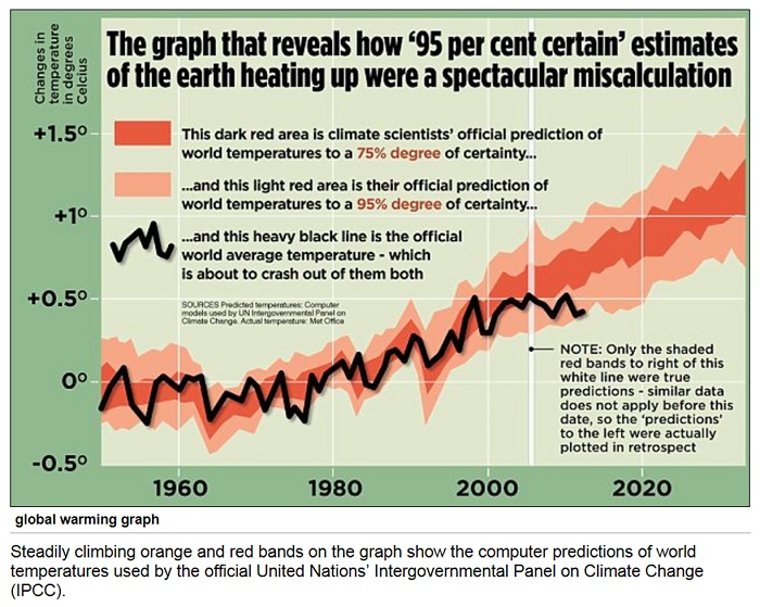
On March 16, 2013 The Daily Mail/Mail Online ran the above chart. ( Link )
David Rose and The Daily Mail/Mail Online claim that temperatures are not following the predictions made by the IPCC. The graph has been widely circulated in the Global Warming Denier blogosphere.
Does the Daily Mail/Mail Online chart show what the IPCC actually said, or is the Daily Mail/Mail Online chart a fabrication of what the IPCC really said?
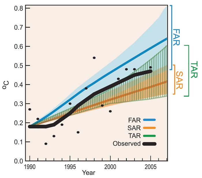
The chart above shows what the IPCC really printed in their 2007 report. http://www.ipcc.ch/pdf/assessment-report/ar4/wg1/ar4-wg1-chapter1.pdf (Page 98)
The Daily Mail/Mail Online and David Rose willfully fabricated still another lie.
David Rose is still
fabricating LIES in 2017
On Feb. 4, 2017 the following article by David Rose was published on the Daily Mail website:
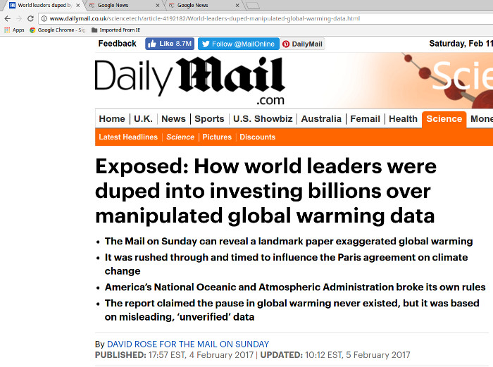
Article source: ( Link )
According to David Rose:
“A high-level whistleblower has told this newspaper that America’s National Oceanic and Atmospheric Administration (NOAA) breached its own rules on scientific integrity when it published the sensational but flawed report”
The “whistleblower” was identified as John Bates – a retired NOAA scientist.
The report was a NOAA confirmation study that there was no “pause” in global warming.
(The “no pause” in global warming was obvious two years ago:
“Global warming 'hiatus' never happened”
Stanford University
http://news.stanford.edu/news/2015/september/global-warming-hiatus-091715.html )
David Rose’s went on to say:
“It's not the first time we've exposed dodgy climate data, which is why we've dubbed it: Climate Gate 2”
In reality, John Bates made no such claim. This is what John Bates really said:
“no data tampering, no data changing, nothing malicious.”
“It's not trumped up data in any way shape or form.”
Source:
“Major global warming study again questioned, again defended”
( Link )
Given all of the above, it is easy to conclude that David Rose fits the category of “Pathological Liar”
“The fabricative tendency is chronic. It is not provoked by the immediate situation or social pressure so much as it is an innate trait of the personality.”
https://en.wikipedia.org/wiki/Pathological_lying
The “Accuracy” of David Rose’s (and other deniers)
“Ice Age” Forecasts
“Ice Age” Forecasts
Global Warming Deniers frequently claim (and/or forecast) that the atmosphere is cooling instead of warming. Here is one of David Rose’s “Fearless Forecasts” which (in 2010) claimed that “The mini ice age starts here” and will likely ”last for 20 or 30 years”.
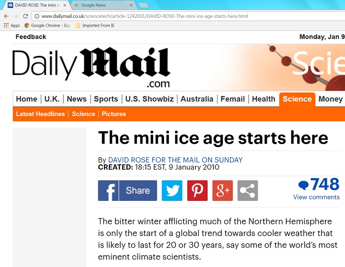
Of course there were no “eminent climate scientists” named in David Rose’s article. In 2010, no legitimate climate scientist made such a forecast. David Rose just fabricated that claim just like other Global Warming Deniers fabricate other claims when they try to legitimatize their fabrications.
And how accurate was this forecast of a “mini ice age” “to last for 20 or 30 years”?
The average global temperature set a new record high in 2010.
And this record high was broken by a new record high in 2014.
And this record high was broken by a new record high in 2015.
And this record high was broken by a new record high in 2016.
(And please check the temperature record in future years.)
Another Global
Warming Denier Lie
As documented above, Global Warming Deniers are not above fabricating false “reports”. Here’s the headline of another example:
“UN Hiding Reports About Inaccurate Global Warming Numbers” ( Link )
This of course is not true, but the assertion needs to be debunked.
The “title” of the actual “report” is:
OVERSENSITIVE
HOW THE IPCC HID THE GOOD NEWS ON
GLOBAL WARMING
HOW THE IPCC HID THE GOOD NEWS ON
GLOBAL WARMING
The content of the “Report” is actually Global Warming Denier propaganda put out by “The Global Warming Policy Foundation”.
http://www.thegwpf.org/
and
( Link )
In turn the GWPF is a “Think Tank” headed by British Politician Lord Lawson – who by an “amazing coincidence” is the same Lord Nigel Lawson who was one of the people featured in Martin Durkin’s pseudo-documentary “The Great Global Warming Swindle”.
http://www.thegwpf.org/who-we-are/
http://en.wikipedia.org/wiki/The_Great_Global_Warming_Swindle
Martin Durkin: “Legitimate scientists - people with qualifications - are the bad guys”
The scientific validity of the “report” is zero.
“The Register” –
And Another Global Warming Denier LIE
“The Register” is another online Global Warming Denier website – and similar to other Deniers, “The Register” circulates typical GWD fabrications and lies. The Print Screen images below were recorded on July 21, 2015.
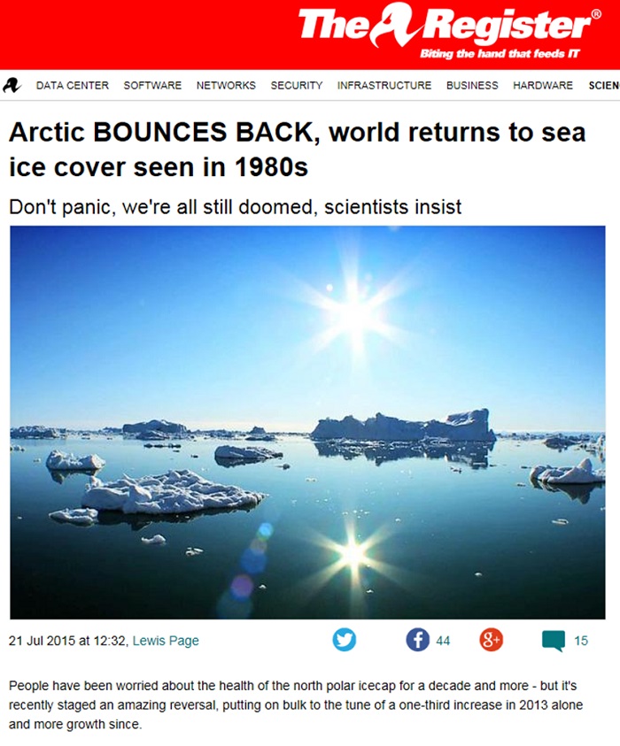
The Print Screen image above records an article that appeared on July 21, 2015 on the online website of “The Register” The Register has fabricated a claim that Arctic sea ice cover has returned to values seen in the 1980s. ( Link )
The claim is another Global Warming Denier LIE.
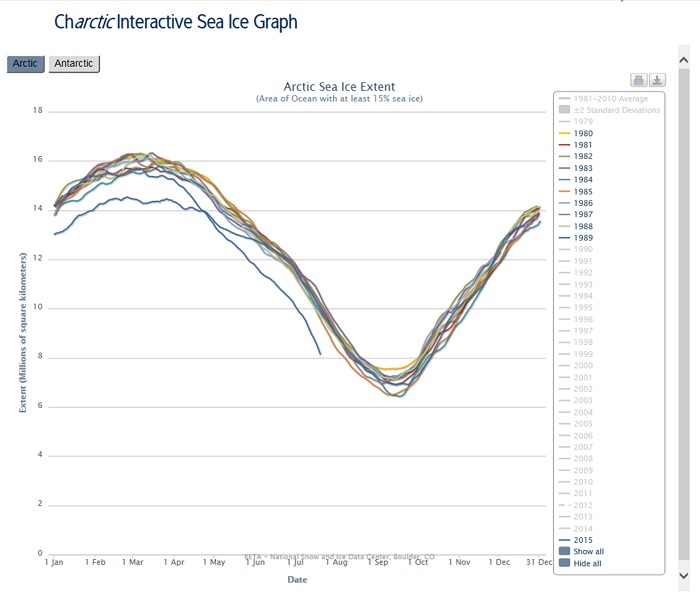
The Print Screen image above is from the National Snow and Ice Data Center, and displays a graph showing Arctic sea ice extent for every year in the 1980s – plus the first part of 2015. The graph can be interactively generated at http://nsidc.org/arcticseaicenews/charctic-interactive-sea-ice-graph/
The top lines in the graph show Arctic sea ice extent for every year from 1980 thru 1989. The lower line shows what has happened so far in 2015. The Register’s claim that the “Arctic BOUNCES BACK, world returns to sea ice cover seen in 1980s” is a LIE.
An Individual
Global Warming Denier
Liar and/or Willful Ignoramus
John Coleman
Liar and/or Willful Ignoramus
John Coleman
“Wing Nut” media often promote “name” people to promote Global Warming Denier ideology – mostly because the GWDs don’t have any evidence - leaving “noise making” as their denial weapon of choice. One of these people was the 80+ year old (recently deceased) John Coleman.

Original source of the picture above was: “Prominent dingbat wants to sue Al Gore for fraud” ( Link )
John Coleman had minimal qualifications and no evidence to back up his mistaken opinions. He had no educational background in either meteorology or climatology. His degree was in Journalism. http://en.wikipedia.org/wiki/John_Coleman_(news_weathercaster)
Just like P. T. Barnam (“I am a showman by profession...and all the gilding shall make nothing else of me” http://en.wikipedia.org/wiki/P._T._Barnum ), Coleman’s “expertise” consisted of entertaining the masses – not educating them.
His contribution as co-founder of the Weather Channel lasted one year before he was forced out (more than 30 years ago) by the other co-founder. Coleman was CEO and president, and was creating major operating losses for the Weather Channel. “Eventually, Landmark forced Coleman out of TWC.” The falling out included a lawsuit which Coleman apparently lost.
http://www.desmogblog.com/john-coleman
and
( Link )
(It appears that KUSI is trying to “vanish” this web page. If anyone would like Print-Screen copies of what it used to look like, please send me an email and I’ll attach the images to my reply.)
In regard to Coleman’s quote
“There is no significant man-made global warming at this time, there has been none in the past” ( Link )
Perhaps John Coleman should have taken a vacation trip to visit the (former) glaciers on the Matterhorn.
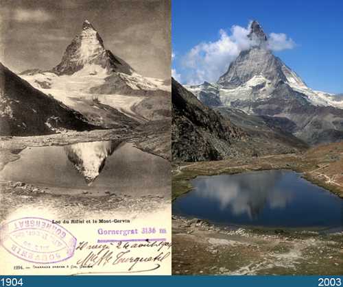
As for the Weather Channel itself:
Global Warming: The Weather
Channel Position Statement
Earth’s climate is indeed warming. Global surface temperature has increased by around 1.8°F (1.0°C) since the late 1800s. More than half of this increase has occurred since the 1970s, and every decade since then has been warmer than the one before it.
Researchers overwhelmingly agree that the main cause of recent global warming is the addition of greenhouse gases to the atmosphere (primarily carbon dioxide) through the burning of fossil fuels.
( Link )
“Accuweather” has the same conclusion.
“Global Warming has Not Stopped” ( Link )
For more information on John Coleman, please see the Guardian article:
“Weather Channel co-founder John Coleman prefers conspiracies to climate science”
John Coleman hasn’t been affiliated with The Weather Channel for over 30 years, rejects climate science, and advances conspiracy theories.
( Link )
James Delingpole
Most Global Warming Deniers tend to be willfully ignorant and/or liars. Another applicable classification might be “Certifiably Delusional”. The delusional category seems to fit James Delingpole – who writes columns for wing-nut websites such as breitbart.com, blogs.telegraph.co.uk, dailymail.co.uk, etc.
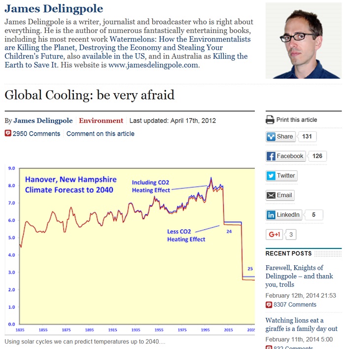
The above article was published by James Delingpole in April 2012.
http://blogs.telegraph.co.uk/news/jamesdelingpole/100151233/global-cooling-be-very-afraid/
The original link above is no longer valid. However you can still see the original article at:
( Link )
In the article, Delingpole tells us how Global Cooling is going to take over the world. For example, the chart above forecasts a sharp drop in temperatures for Hanover, NH. The first of two sharp temperature plunges should have been in place by the year 2015.
Well, 2015 showed a worldwide record jump upward in temperatures. To date, Delingpole hasn’t explained “What went wrong”.
For a historical 2010 view of Delingpole’s Global Cooling obsession (Delingpole is convinced that there is Global Cooling but it is being covered up by a world “Conspiracy”), please see:
Global Cooling and the New World
Order. Global Cooling on the Agenda of the Bilderbergs
By James Delingpole
( Link )
By James Delingpole
( Link )
(In reality, 2010 set a new record for world warmth, until that record was broken in 2014, until that record was broken in 2015 . . .)
Delingpole also shows a complete ignorance when it comes to the role and source of carbon dioxide.
From: https://climatesanity.wordpress.com/tag/anthropogenic-co2/
Cliff: Ah, you know we’ve got, the greenies are all against cars and the exhaust, and you know, all this pollution that we put in the air. Ah, what’s the equivalency of a volcano that’s erupting and spewing stuff into the air thirty miles high.
Delingpole: That’s a good question. You remember that volcano that erupted in Iceland a couple of years ago?
Cliff: Yep, that’s the one that made me start thinking about it
Delingpole: Yeah, I think that, I think that that – that volcano produced more CO2 than I think humans have produced in the last, in the last fifty years.
In reality, human activities produce over 100 times as much CO2 per year as volcanoes For example, please try to find any volcano eruption (including Mount Pinatubo - the second biggest Volcanic Eruption in the 20th century) on this CO2 graph. http://www.esrl.noaa.gov/gmd/ccgg/trends/full.html
And what are Delingpole's qualifications for what he writes?
Delingpole: “not because I have a science degree - which I don't”
( Link )
And how much time does Delingpole devote to research?
Question from Snope's: “How long did it take to research this piece?”
Delingpole: “My answer:”
“As little time as I possibly could.”
( Link )
Also please see: “It's official: a new Ice Age is on its way.” June 15, 2011
Original link:
Archived link:
Global Cooling and the New World Order By James Delingpole
Sept. 26, 2010
( Link )
“that over a decade of global cooling such as that that we have experienced”
About Feb. 2012
( Link )
Deceit by
Breitbart
Deceit: http://www.dictionary.com/browse/deceit?s=t
“the act or practice of deceiving; concealment or distortion of the truth for the purpose of misleading; duplicity; fraud; cheating”

On Nov. 30, 2016 Breitbart ran a story with the headline “Global Temperatures Plunge. Icy Silence from Climate Alarmists”
( Link )
If you check the temperature charts shown earlier on this web page, we see that in reality, global temperatures have not plunged. In fact 2016 set another new record high in global temperatures.
In the first paragraph of the story, Breitbart tries to use “land temperatures” as a proxy for global temperatures. As shown earlier on this page, land temperatures are subject to a large amount of random variation. The land temperature chart shows a steadily rising trend in temperatures, and the moving average is making new record highs as of late 2016.
Upon further inspection, we see that the article was authored by James Delingpole. (See the section above for more information on the pathological lies of James Delingpole.)
Fraud and Deceit
by “Steven Goddard”
Steven Goddard (whose real name is Tony Heller https://en.wikipedia.org/wiki/Steven_Goddard ) runs the realclimatescience dot com website. Goddard (Heller) is another typical Global Warming Denier in that he uses deceit/fraud to promote the denier agenda.

The picture above is a PrintScreen image from Dr. Keith Strong's video which can be seen at https://www.youtube.com/watch?v=QzWd1eHS4j4 . It should give you some idea of what (and not necessarily "who") Tony Heller (alias Steven Goddard) really is.
Dr. Strong's video is titled "Tony Heller: Graph Abuser".
On March 7, 2016 Heller posted an article titled “NOAA Radiosonde Data Shows No Warming For 58 Years”

( Link )
The article included a fabricated graph that allegedly implied that Radiosonde (Weather Balloon) data showed no warming as compared to 58 years ago.
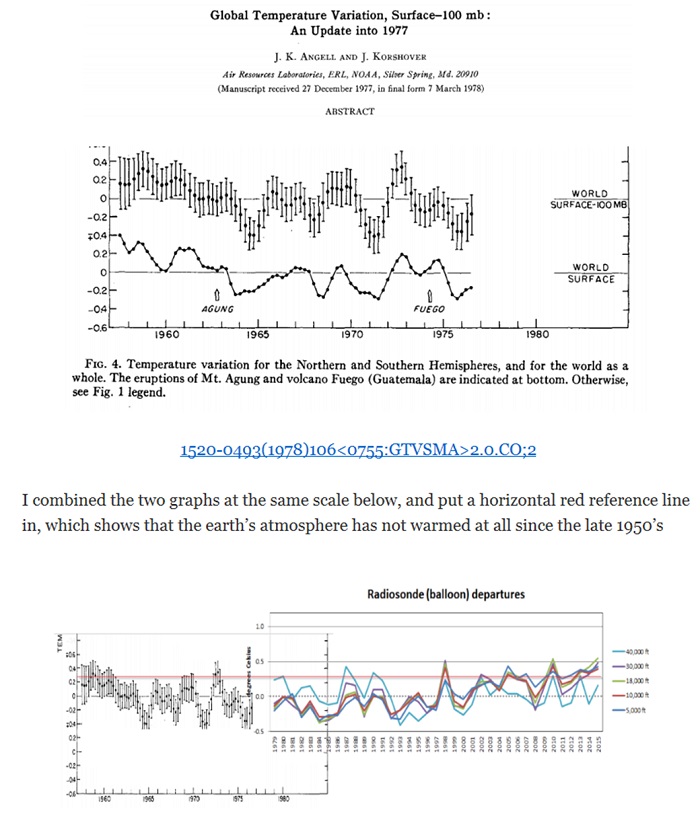
The picture above shows how Steven Goddard (real name Tony Heller) combined two different graphs that measure two different observation data sets to get a single graph. In particular, note the words “I combined the two graphs”.
There are several examples of outright fraud in Steven Goddard’s (real name Tony Heller) presentation.
1) The real complete radiosonde data set is available at ftp://ftp1.ncdc.noaa.gov/pub/data/ratpac/ratpac-a/ . Why would anyone “combine the two graphs” when the real single-source data set is available? Graphs for the real data were shown earlier on this web page, and they show accelerating warming for the entire period of record.
2) The left side of the graph that Steven Goddard (real name Tony Heller) fabricated contains temperature data up to the 100 mb level in the stratosphere. As shown earlier on this web page, the 100 mb level in the stratosphere is cooling as per global warming models. Steven Goddard’s fabricated chart combines stratospheric cooling (left side of Goddard's graph) with tropospheric warming (right side of Goddard’s graph), and then he alleges “NOAA Radiosonde Data Shows No Warming For 58 Years”.
Steven Goddard (real name Tony
Heller): “The earlier data showed as much pre-1979 cooling as
the post-1979 warming.”
3) The original chart that Steven Goddard (real name Tony Heller) used was published in the Journal of the American Meteorological Society, and was used to show short term variations in global temperatures. This included normal brief cooling that follows volcanic eruptions. Steven Goddard erased the labels for the Mt. Agung and Fuego eruptions from his combined chart.
More “willful deception” by
Steven Goddard (real name Tony Heller)
Here is another example of “willful deception” (“the act of causing someone to accept as true or valid what is false or invalid” https://www.merriam-webster.com/dictionary/deception ) by Steven Goddard (real name Tony Heller).
On Dec. 5, 2016 Steven Goddard (real name Tony Heller) posted the following on his blog under the title “Global Land Temperatures Cooling the Fastest In Over A Century”.
https: //realclimatescience .com/2016/12/global-land-temperatures-cooling-the-fastest-in-over-a-century/
(Remove the spaces for a valid link.)
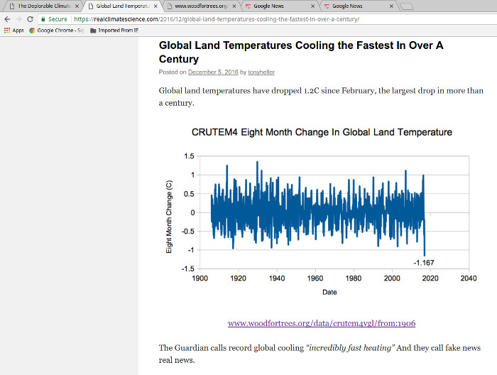
The picture above is a PrintScreen image from the above URL. The graph shows a highly irregular trace that Tony Heller uses to claim:
“Global Land Temperatures Cooling the Fastest In Over A Century”.
The link on Heller’s website refers to the woodfortrees.org website. The woodfortrees.org website is an online graphing service. The woodfortrees.org website will plot any data that the user provides. The woodfortrees.org website does not check to see if the data is a truthful data set or is someone’s fabrication.
If you click on Heller’s link, a data set is shown which appears to be real data from the Hadley Center’s Climate Research Unit. The link’s data set shows gradual warming underneath the random short term fluctuations. However, this data set is not what is shown in Tony Heller’s graph.
Tony Heller’s graph has a plot value of -1.167 toward the right hand portion of the graph (Most recent data plot). However, the data set shown in the link has no -1.167 value for recent observations.
The referenced data set has multiple recent values greater than +1.00. None of these values of +1.00 or greater show up in Heller’s graph.
Tony Heller has fed some unknown data set into woodfortrees.org, but this data (what is shown in the graph) is not what is given by his link.

The graph above shows what is really happening to temperatures over land areas in the northern hemisphere. The red line shows that land areas in the northern hemisphere are warming at about 8.3 degrees F per century.
Data for the above graph can be accessed at:
https://www.ncdc.noaa.gov/monitoring-references/faq/anomalies.php
Even Global Warming Denier Anthony Watts knows that Steven Goddard (real name Tony Heller) fabricates his graphs to try to justify an “alternate reality” conclusion.
For example: Anthony Watts to Steven Goddard in regard to an article authored by Steven Goddard:
“The title and conclusion are wrong due to bias in the start/end point of the graph”
https://wattsupwiththat.com/2010/07/02/arctic-ice-increasing-by-50000-km2-per-year/
Steven Goddard's (real name
Tony Heller) reporting on Greenland
Then there is Tony Heller's willful misrepresentation on what is happening to Greenland's ice mass balance. On April 17, 2018 Tony Heller posted an article stating
"A Trillion Tons Of New Ice In Greenland".
https://realclimatescience.com/2018/04/a-trillion-tons-of-new-ice-in-greenland/
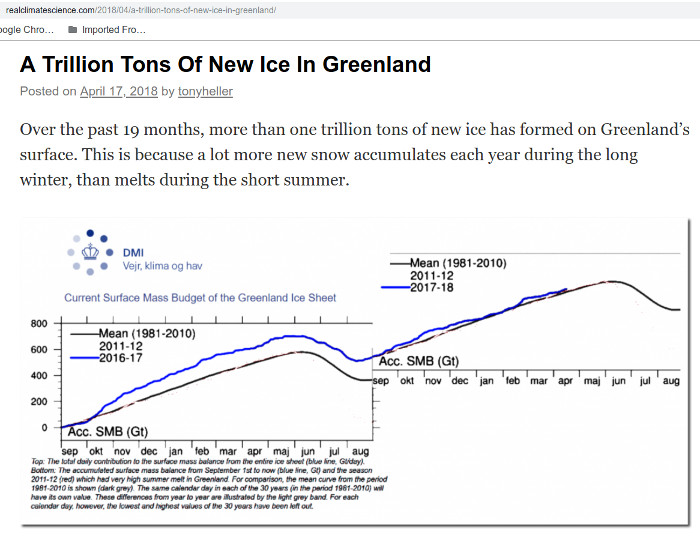
At first glance you would think that Greenland is gaining ice. What Tony "forgot" to mention was that "SMB" (Surface Mass Balance) only includes new snow that falls on the existing ice cap. It does NOT include the Trillions of Tons of old ice that Greenland's glaciers were shedding due to calving and direct melting into the ocean.
If we look at NASA's Global Climate Change/Ice Sheets web page, we get the complete picture. https://climate.nasa.gov/vital-signs/ice-sheets/
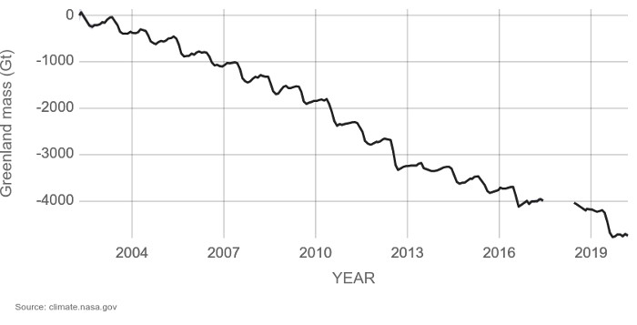
There is no 1,000 GT (1 trillion tons) spike in Greenland's ice mass balance. However, there is a 5,000 (+/-) GT net loss in ice mass from 2002 to 2020. On average, Greenland is losing about 275 billion metric tons of ice per year.
Also, please see the “Forty-six years of Greenland Ice Sheet mass balance from 1972 to 2018” research paper published in the journal of the Proceedings of the National Academy of Sciences of the United States of America.
https://www.pnas.org/content/116/19/9239
The purple line in Fig 3H shows that Greenland lost 5,000 billion metric tons of ice from 1972 to 2018. (One metric ton ~= 2,205 pounds) This paper confirms that there never were a “A Trillion Tons Of New Ice in Greenland” as per Tony Heller's fabrication.
Tony Heller's website (Real Climate Science) has even got a "Pseudo-Sci Level = Quackery" rating at Media Bias/Fact Check. https://mediabiasfactcheck.com/real-climate-science/
Summary: The heading on this web page states:
“Global Warming Deniers claim that Global Warming is a hoax/fraud/scam. They lie, they are willfully ignorant, and they are wrong.”
Steven Goddard (real name Tony Heller) is still another example of the fraud committed by Global Warming Deniers.
For more information about “off-the-reality-rails rants” by Steven Goddard (real name Tony Heller), please see the “New Lows: Sea Ice and “Steven Goddard” credibility”
at:
https://climatecrocks.com/2011/09/14/new-lows-sea-ice-and-steven-goddard-credibility/
and/or
“Symptom Of A Liar”
http://reallysciency.blogspot.com/
and/or
How to cherry-pick data to PROVE “global cooling”
http://redgreenandblue.org/2018/08/15/cherry-pick-data-prove-global-cooling/
and/or
Tony Heller's false claims earned a [Liar, Liar] “Pants on Fire” rating from Politifact
https://www.politifact.com/punditfact/statements/2014/jun/25/steve-doocy/foxs-doocy-nasa-fudged-data-make-case-global-warmi/
This guy “nails” the real Steven Goddard (real name Tony Heller).
https://tonyhellerakastevengoddardisnotasociopath.wordpress.com/who-is-tony-heller/
Probable address:
Anthony Heller
Apt. 102
6509 Quiet Hours
Columbia, MD 21045
Tel. (970) 460-6147
Email: tonyheller@gmail.com
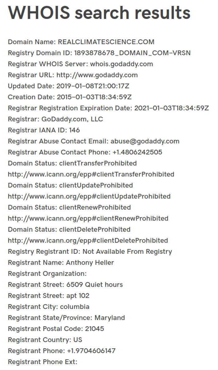
The Print Screen picture above shows the Internet Registration record for Tony Heller's "The Deplorable Climate Science Blog" website ( https:// realclimatescience .com/ ) Note the 2019 update. The URL registration for the website is issued to Heller's address in Columbia, Md. (The URL registration address has been 6509 Quiet Hours for several years.)
Data source:
Enter
realclimatescience.com
at http://centralops.net/co/domaindossier
Note: When a domain name (such as realclimatescience.com) is registered, the owner of the website must give correct information. Every year, ICANN (the registry organization) requires the website owner to correct any incorrect information or the account (the domain name) is subject to cancellation.
https://www.icann.org/resources/pages/register-domain-name-2017-06-20-en
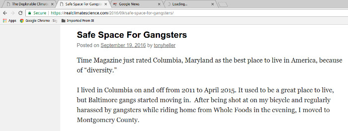
The picture above is a Print Screen image from Heller's realclimatescience.com website (note the URL near the top) of a claim by Tony Heller that he moved from Columbia, MD in April 2015. The posting date is September 19, 2016. He claims that he currently lives in Boulder, CO. (Just run a Google site-search for Boulder on his website - https://www.google.com/search?q=site:realclimatescience.com+boulder )
Yet the 2019 URL registration of his website shows that he is still living at 6509 Quiet Hours in Columbia, MD. Tony Heller not only lies about Global Warming, he also lies about where he lives.
Also
http://website.informer.com/Anthony+Heller.html
(Confirms the 6509 Quiet Hours address)

and/or
http://whois.stsoftware.biz/realclimatescience-com.htm
(Also confirms the 6509 Quiet Hours address. )
and/or
https://www.godaddy.com/whois/results.aspx?domain=REALCLIMATESCIENCE.COM
(Also confirms the 6509 Quiet Hours address. )

The picture above is a PrintScreen image from the Locate Family website. It was accessed on May 1, 2017. (The address was reconfirmed via the Locate Family website on Aug. 9, 2018) It is a confirmation that Anthony Heller still lives in Columbia MD. On his blog, Tony claims that he lives in Boulder CO. This claim appears to be a fabrication just like Anthony Heller's other fabrications.

The above picture uses a reverse telephone look-up to confirm Tony Heller's Columbia, MD address.
A reverse telephone look-up as of May 10, 2020 shows that Tony Heller is still living in a 704 sq. ft. HUD subsidized apartment at 6509 Quiet Hours. ( Click for picture. )
Note: On his blog, Anthony Heller occasionally shows photographs taken in Boulder. At least some of the photos are legitimately taken in Boulder, but the "Boulder photos" are presumably taken by an associate of Anthony Heller and then emailed to him. Anthony Heller then posts the photos on his blog as part of his address/location fabrication.
The 6509 Quiet Hours, Apt 102 address is a 704 sq. ft., “Bedford” unit in the HUD subsidized (low income) “Chimneys of Cradlerock” complex.
( Link )
6509 Quiet Hours Apt. 102 is near the top of the above map.

All of the above brings up the question of “why” do Steven Goddard (real name Tony Heller) and many other Global Warming Deniers go out of their way to reject reality. This motivation may be answered by the following question:
Q: We might ask: What happens to someone who ends up being a financial failure and wants to blame “The Conspiracy” for all of their problems?
A: http://www.dictionary.com/browse/malcontent
Adjective
1. not satisfied or content with currently prevailing conditions or circumstances.
2. dissatisfied with the existing government, administration, system, etc.
Noun
3. a malcontent person, especially one who is chronically discontented or dissatisfied..
Note: This is the same Steven Goddard (real name Tony Heller) who is convinced that there is a “Conspiracy” that has turned historical temperatures from “a 90 year cooling trend into a warming trend”.
https://stevengoddard.wordpress.com/2014/01/19/just-hit-the-noaa-motherlode/
The details of how and why how Tony (Anthony) Heller's life deteriorated from a claimed master's degree from Rice University (a good school) down to a financial failure living in a 704 sq. ft. HUD subsidized apartment are not known, but obviously something went terribly wrong in Tony Heller's life. Of note: A search of Rice University's alumni web page ( https://alumni.rice.edu/ ) did NOT find any hits for "Anthony Heller" or "Tony Heller" - with or without quotes.)
Also please see:
“Denier Steven Goddard Makes Ass of Himself on Washington Post, Confuses Sea Ice with a Glacier”
( Link )
Note: There is an Anthony Heller living in a 1080 sq. ft. condo at 663 Walden Cir. in Boulder, CO; but this appears to be a different person as this person is not shown as ever living in Columbia, MD., or in Tempe, AZ (Heller's ASU degree), or in Houston, TX (Heller's claimed Rice University Master's degree).
https://www.intelius.com/people-search/Anthony-Heller/Boulder-CO
Also, Colorado voter records show that this Anthony Heller's former address was in Fort Collins, CO - not Columbia, MD.
https://coloradoresidentdb.com/person/8092386/anthony_heller
Tony Heller has sent me private emails "challenging" me to a debate.
My replies to Anthony Heller were:
Email 1:
Please feel free to debate any of my web pages any time you want. Science is about evidence - what really exists. That is what is on my website - including links so that other investigators can confirm (or deny) what I have posted.
Email 2:
It is highly unlikely that we will engage in a public debate.
1) Traveling to Columbia MD is not on my "to do" list. (Note: I have expanded the section of independent sources that state that you live at 6509 Quiet Hours. There appear to be no independent sources that state that you live in Boulder.)
2) It would be a waste of my time to "debate" with any "pathological fabricator" / malcontent / financial failure. I state my position on my web pages. You can debate them any time that is convenient for you.
This is from a recent email that I sent to Tony Heller.
"What I do have is a distinct distaste for dishonest people - like you. Presumably, your Master's degree in electrical engineering is legit. Something has gone wrong in your life for you to end up in a 704 sq. ft. HUD subsidized apartment. You ride a bicycle because you can't afford a car. And because of what has happened in your life, you have become bitter and vindictive against the scientific world that you were once a part of. This apparently is your motive for your lying and fabrications.
If you wish to state otherwise, provide a documented history of your life on your website."
1) Anthony Heller pretended that his name was Steven Goddard until his real name was discovered. Anthony Heller pretended that Steven Goddard was a separate person. Anthony Heller fabricated the Steven Goddard name.
2) As per the above independent third parties, Anthony Heller has fabricated where he lives.
3) As documented above, Anthony Heller willfully fabricates the "facts" on his blog.
It is easy to conclude that Anthony Heller is a “pathological fabricator”.
Lies by the Heartland
Institute
While some Global Warming Deniers are just willfully ignorant. the Heartland Institute appears to be a “Liars for pay” “Think Tank”.
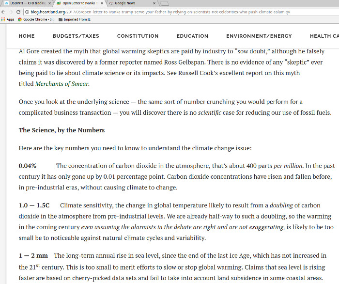
The picture above is a PrintScreen image from Heartland’s (Joe Bast’s) “Open Letter to Ivanka Trump” that was published on the Heartland blog on May 15, 2017.
( Link )
There are several statements on the Heartland’s web-page that are blatantly false.
1) The Heartland Institute:
“Al Gore created the myth that global warming skeptics are paid by industry to “sow doubt,” although he falsely claims it was discovered by a former reporter named Ross Gelbspan.”
Reality:
Long before Al Gore started to publicize Global Warming and 8 years before his “An Inconvenient Truth” movie, the following article was in the New York Times.
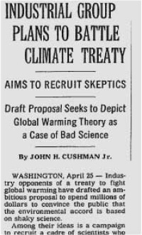 INDUSTRIAL GROUP PLANS TO
BATTLE CLIMATE TREATY
INDUSTRIAL GROUP PLANS TO
BATTLE CLIMATE TREATYBy JOHN H. CUSHMAN JR.
APRIL 26, 1998
“Industry opponents of a treaty to fight global warming have drafted an ambitious proposal to spend millions of dollars to convince the public that the environmental accord is based on shaky science.http://www.nytimes.com/1998/04/26/us/industrial-group-plans-to-battle-climate-treaty.html
Among their ideas is a campaign to recruit a cadre of scientists who share the industry's views of climate science and to train them in public relations so they can help convince journalists, politicians and the public that the risk of global warming is too uncertain to justify controls on greenhouse gases like carbon dioxide that trap the sun's heat near Earth.”
2) The Heartland Institute:
“0.04 % The concentration of carbon dioxide in the atmosphere, that’s about 400 parts per million. In the past century it has only gone up by 0.01 percentage point.”
Reality:
From the Earth System Research Laboratory – Global Monitoring System
https://www.esrl.noaa.gov/gmd/ccgg/trends/history.html
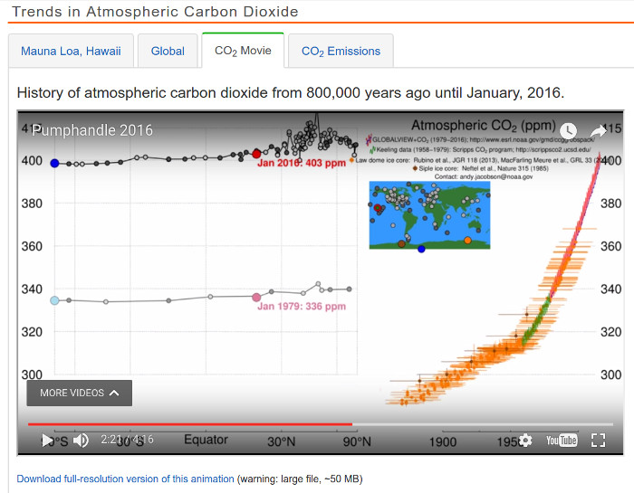
The picture above is a PrintScreen image from the “CO2 Video” at the Earth System Research Laboratory. The video shows that in the last 100 years, the atmospheric concentration of carbon dioxide has increased from a little under 300 parts per million to a little over 400 parts per million. That is about a 35% increase. If you watch the whole video you will see that current levels of carbon dioxide are far above anything else seen in the previous 800,000 years.
3) The Heartland Institute:
“1 — 2 mm The long-term annual rise in sea level, since the end of the last Ice Age, which has not increased in the 21st century. This is too small to merit efforts to slow or stop global warming. Claims that sea level is rising faster are based on cherry-picked data sets”
Reality:
Sea level had been stable (very little change) for the last 7,000 years – up until about 200 years ago. https://commons.wikimedia.org/wiki/File:Post-Glacial_Sea_Level.png
Then as human generated carbon dioxide started to pick up, global warming insidiously began to take place and sea level started to rise due to thermal expansion and glacial melting.
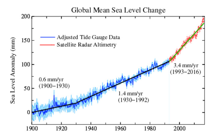
The picture above is from Columbia University’s web page on sea level.
http://www.columbia.edu/~mhs119/SeaLevel/
It shows that the rate of sea level rise has more than quintupled since the early 1900s.
When the Heartland Institute says “1 — 2 mm The long-term annual rise in sea level, since the end of the last Ice Age, which has not increased in the 21st century.”, it is a willful falsehood. In plain language – The Heartland Institute is lying.
And then then is always Heartland's forecast record. In 2013 Heartland's observation and forecast was:
"the fact that the Earth entered a natural and predictable cooling cycle around 1997 or 1998. It has been cooling ever since!"It’s Not Just Winter, It’s a New Ice Age
http://blog.heartland.org/2013/11/its-not-just-winter-its-a-new-ice-age/
The result has been that every year starting with 2014 has been warmer than any year before 2014.
Ignorance Combined with
Gullibility by the Heartland
Then there is plain old ignorance and gullibility by the Heartland. The following two pictures are Print Screen images from an article by the Heartland.
https://www.heartland.org/news-opinion/news/how-al-gore-built-the-global-warming-fraud
also posted at:
http://www.cfact.org/2018/10/20/how-al-gore-built-the-global-warming-fraud/
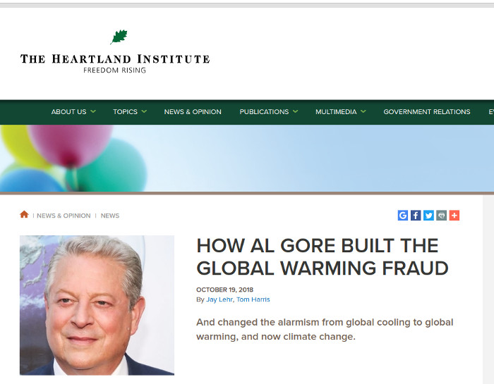
The title for the article.
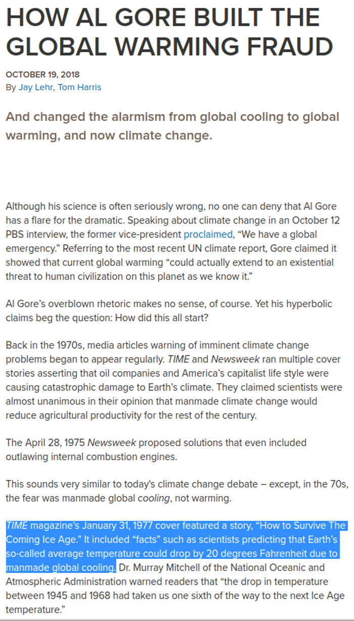

The first few paragraphs of the article
Notice the section in blue that states: “TIME magazine’s January 31, 1977 cover featured a story, “How to Survive The Coming Ice Age.” It included “facts” such as scientists predicting that Earth’s so-called average temperature could drop by 20 degrees Fahrenheit due to manmade global cooling.”
Do they realize how ignorant/dishonest they reveal themselves to be when they “quote” this source? Time Magazine never had a cover/story about “How to Survive The Coming Ice Age”. The “cover” was a fabrication by Global Warming Deniers. Please see:
( Link )
and/or
( Link )
Our Lying
Political Leaders
Lying isn’t limited to just television, newspaper, and media. It also takes place in the U. S. Senate. The picture below is an excerpt from the Congressional Record.
(Click on picture for a large image.)
The picture above shows Oklahoma’s Senator Jim Inhofe lying, as documented in the Congressional Record. https://www.congress.gov/crec/2014/07/28/CREC-2014-07-28-pt1-PgS4988-2.pdf
Senator Jim Inhofe said:
“In fact, for the past 15
years temperatures across the globe have not increased. Let’s
think about that. Is anyone listening here? Temperatures have
not increased over the last 15 years.”
(If you follow the link, scroll down one page to get to page S4989.)
Please check the NOAA/NCDC chart (shown earlier) to see what “the scientific record” recorded for this time period.
Also, please see another example of a Global Warming Denier’s assertion that Global Warming has stopped.
http://www.durangobill.com/GwdLiars/FabiusMaximusIgnorance.html
The Fabius Maximus Website is an example of a Global Warming Denier website. A look at the evidence that shows that GWDs lie, they are willfully ignorant, and they are wrong.
Anatomy of Denial
From: Powell, James Lawrence. "The Inquisition of Climate Science". Columbia University Press.Powell 2012, pp. 170–173 as quoted from Wikipedia.
https://en.wikipedia.org/wiki/Climate_change_denial
Global warming deniers…. throw up a succession of claims, and fall back from one line of defense to the next as scientists refute each one in turn. Then they start over:
The earth is not warming.
All right, it is warming but the Sun is the cause.
Well then, humans are the cause, but it doesn't matter, because it warming will do no harm. More carbon dioxide will actually be beneficial. More crops will grow.
Admittedly, global warming could turn out to be harmful, but we can do nothing about it.
Sure, we could do something about global warming, but the cost would be too great. We have more pressing problems here and now, like AIDS and poverty.
We might be able to afford to do something to address global warming some-day, but we need to wait for sound science, new technologies, and geoengineering.
The earth is not warming. Global warming ended in 1998; it was never a crisis.
Global Warming
Models
How accurate are the computer models that are used to forecast global warming? The chart below is from an in depth essay on global warming at the American Institute for Physics. http://www.aip.org/history/climate/summary.htm
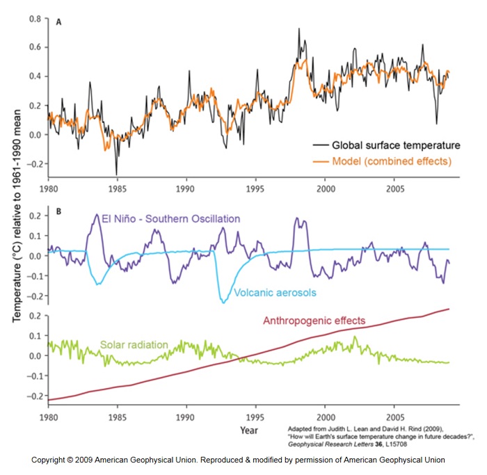
The top part of the chart shows actual observed temperature anomalies vs. what the computer models produce. The bottom part of the chart shows 4 primary components that are used for the computer models. Volcanic eruptions and El Nino are basically random events, and thus their short term fluctuations cannot be predicted in advance. A good reference for tracking current El Nino status is the Earth System Research Laboratory’s web page at:
http://www.esrl.noaa.gov/psd/enso/mei/
Solar irradiance varies slightly with the 11year sunspot cycle. There is some variability in the length of the cycle and its magnitude, but overall it has just a small influence and irradiance has actually been negative in recent decades.
The largest influence is “Anthropogenic Effects” with human generated carbon dioxide outweighing all other components. With atmospheric carbon dioxide on a relentless climb, guess what is going to happen to the earth’s temperature in the future?
“Computer Climate
Models Are Not Fundamentally Flawed”
As reported at: ( Link )
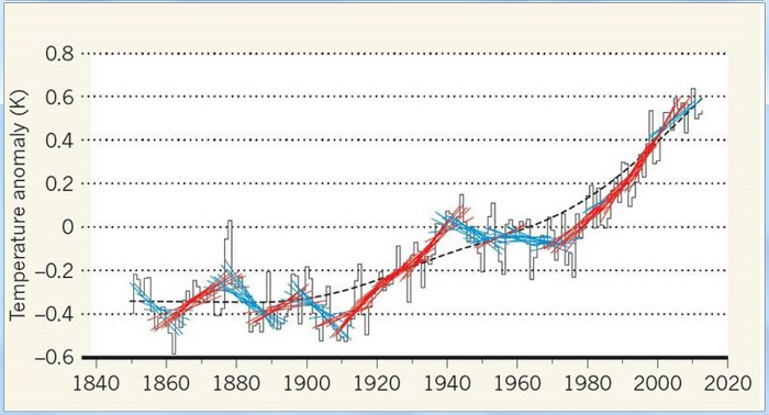
“Fifteen-year temperature trends. The solid black line is the time series of the global mean surface temperature, plotted as a departure (anomaly) from a baseline period 1961–90. The dashed black line is a smooth fit to this series, representing the long-term warming rate. The blue and red lines are linear trends for each 15-year segment running over 1850–64, 1851–65, …, 1999–2013. Each 15-year segment is shown in red if the trend rises faster than the long-term warming rate in the same 15-year period and blue if it rises more slowly. Marotzke and Forster show that these 15-year trends are dominated by natural (free) variations. The free variations drive the 15-year trends above and below the long-term warming rate as they ride along with it. Courtesy: Nature.”
Citation:
Forcing, feedback and internal variability in global temperature trends by Jochem Marotzke & Piers M. Forster published in Nature, doi:10.1038/nature14117
Our Best
Knowledge
The best information about changes in the world’s climate can be found in our best educational institutions.
The following organizations provide evidence that:
1) Global Warming / Climate Change is real.
2) Human activities are by far the largest causative agent.
3) Global Warming / Climate Change is a continuing, ongoing phenomenon.
Massachusetts Institute of Technology
“Report: Human activity fuels global warming”
http://web.mit.edu/newsoffice/2007/climate.html
NASA's Jet Propulsion Laboratory | California Institute of Technology
Climate change: How do we know?
"The current warming trend is of particular significance because most of it is extremely likely (greater than 95 percent probability) to be the result of human activity since the mid-20th century and proceeding at a rate that is unprecedented over decades to millennia."
https://climate.nasa.gov/evidence/
Stanford University
“A large body of scientific information indicates that global climate change is unequivocal, almost certainly is caused mostly by human activities, is already causing significant harm, and as it continues, holds great risks for our future.”
https://pangea.stanford.edu/programs/outreach/climatechange/
California Institute of Technology
Climate Change Science
“Greenhouse gases are accumulating in Earth’s atmosphere as a result of human activities, causing surface air temperatures and subsurface ocean temperatures to rise.”
http://web.gps.caltech.edu/classes/ese148a/NASclimatechange.pdf
Columbia University
“The Greenhouse Effect and Global Warming”
“With higher CO2 concentrations come expectations of a stronger greenhouse effect and therefore warmer global temperatures.”
http://www.columbia.edu/~vjd1/greenhouse.htm
Atmospheric Sciences - University of Illinois - Champaign
“Evidence continues to mount that human activities are altering the Earth’s climate on a global scale.”
http://www.atmos.uiuc.edu/research/01climate.html
Woods Hole Oceanographic Institution
http://www.whoi.edu/main/topic/global-warming
Scripps Institution of Oceanography (University of California - San Diego)
http://scripps.ucsd.edu/img/climate_flyer.pdf
If global warming stopped in 1998, please provide an explanation as to why our best schools and universities are providing evidence that global warming is continuing.
Conclusion
The actual observations show that global warming didn’t stop in 1998. What is happening is that a few Global Warming Deniers fabricated a story, and the other members of the Global Warming Denier cult continue to demonstrate their willful ignorance by repeating the same false story.
Return to the Global Warming Deniers index page
Return to Durango Bill’s home page
Web page generated via Sea Monkey's Composer HTML editor
within a Linux Cinnamon Mint 18 operating system.
(Goodbye Microsoft
